Install & Download:
# Yarn
$ yarn add vue-css-donut-chart
# NPM
$ npm install vue-css-donut-chart --save
Description:
A lightweight Vue component for drawing donut charts on apps using CSS. Compatible with both Vue 3 and Vue.2.
How to use it:
1. Import and register the component.
import Donut from 'vue-css-donut-chart';
import 'vue-css-donut-chart/dist/vcdonut.css';
Vue.use(Donut);
2. The example shows how to create a basic donut chart.
<template>
  <vc-donut :sections="sections">Basic donut</vc-donut>
</template>
export default {
  data() {
    return {
      sections: [
        { label: 'Red section', value: 25, color: 'red' },
        { label: 'Green section', value: 25, color: 'green' },
        { label: 'Blue section', value: 25, color: 'blue' }
      ]
    };
  },
  methods: {
    handleSectionClick(section, event) {
      console.log(`${section.label} clicked.`);
    }
  }
};
3. Available component props.
// diameter of the donut
size: { type: Number, default: 250, validator: v => v > 0 },
// unit to use for `size`
unit: { type: String, default: 'px' },
// percentage of donut ring's thickness
thickness: {
  type: Number,
  default: 20,
  validator: v => v >= 0 && v <= 100
},
// text in the middle of the donut, this can also be passed using the default slot
text: { type: String, default: null },
autoAdjustTextSize: { type: Boolean, default: true },
// color to use for the middle of the donut
// set this to `transparent` or `thickness` to 100 to make a pie chart instead
background: { type: String, default: '#ffffff' },
// color to use for the empty ring areas
foreground: { type: String, default: '#eeeeee' },
// sections of the donut, must have a `value` property
// other valid properties are `label` and `color` (default is `dodgerblue`)
sections: {
  type: Array,
  default: () => [],
  validator(sections) {
    for (let i = 0; i < sections.length; ++i) {
      /* istanbul ignore if - already covered by unit tests for sectionValidator */
      if (!sectionValidator(sections[i])) return false;
    }
    return true;
  }
},
total: { type: Number, default: 100, validator: v => v > 0 },
hasLegend: { type: Boolean, default: false },
legendPlacement: {
  type: String,
  default: placement.BOTTOM,
  validator: val => !!placement[val.toUpperCase()]
},
// degree angle at which the first section begins
startAngle: { type: Number, default: 0 }
4. Events.
- @section-click
- @section-mouseenter
- @section-mouseleave
- @section-mouseover
- @section-mouseout
- @section-mousemove
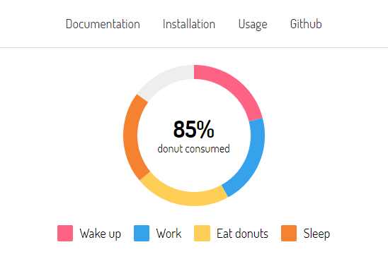
Preview:
Changelog:
v1.3.2 (10/30/2021)
- Upgrading to Vue 2.6.14 broke the package when using it with Vue versions lower than 2.6.13. This version reverts that change and goes back to using 2.6.11.