Install & Download:
# NPM
$ npm i v-network-graph --save
Description:
An interactive, draggable, SVG based network graph visualization component for Vue 3.
Basic Usage:
1. Import and register the component.
import VNetworkGraph from "v-network-graph"
import "v-network-graph/style.css"
Vue.use(VNetworkGraph);
2. Add the v-network-graph component to the template.
<template>
  <v-network-graph
    :nodes="nodes"
    :edges="edges"
  />
</template>
3. Prepare your node & edge data as follows:
import { defineComponent } from "vue"
export default defineComponent({
  setup() {
    const nodes = {
      node1: { name: "Node 1" },
      node2: { name: "Node 2" },
      node3: { name: "Node 3" },
      // ...
    }
    const edges = {
      edge1: { source: "node1", target: "node2" },
      edge2: { source: "node2", target: "node3" },
      // ...
    }
    return { nodes, edges }
  },
})
4. Default component props.
nodes: {
  type: Object as PropType<Nodes>,
  default: () => ({}),
},
edges: {
  type: Object as PropType<Edges>,
  default: () => ({}),
},
layouts: {
  type: Object as PropType<UserLayouts>,
  default: () => ({}),
},
zoomLevel: {
  type: Number,
  default: 1,
},
selectedNodes: {
  type: Array as PropType<string[]>,
  default: () => [],
},
selectedEdges: {
  type: Array as PropType<string[]>,
  default: () => [],
},
configs: {
  type: Object as PropType<UserConfigs>,
  default: () => ({}),
},
paths: {
  type: Array as PropType<Paths>,
  default: () => [],
},
layers: {
  type: Object as PropType<Layers>,
  default: () => ({}),
},
eventHandlers: {
  // Since a large number of events will be issued, to avoid
  // contaminating the event log of the development tools,
  // events are designed to be notified to a handler function
  // specified by the user.
  type: Object as PropType<EventHandlers>,
  default: () => ({}),
},
5. Default configurations.
{
  view: {
    scalingObjects: boolean, // whether to expand the entire object.    default: false
    panEnabled: boolean,     // whether the pan is enabled or not.      default: true
    zoomEnabled: boolean,    // whether the zoom is enabled or not.     default: true
    minZoomLevel: number,    // minimum zoom level.                     default: 0.1
    maxZoomLevel: number,    // maximum zoom level.                     default: 64
    fit: boolean,            // whether to fit the content when loaded. default: false
    layoutHandler: LayoutHandler, // class to control node layout.   default: new SimpleLayout()
    onSvgPanZoomInitialized: undefined | (instance) => void, // callback on init svg-pan-zoom. default: undefined
    grid: {
      visible: boolean,         // whether to show the grid in the background. default: false
      interval: number,         // grid line spacing.                          default: 10
      thickIncrements: number,  // increments of ticks to draw thick lines.    default: 5
      line: {                   // normal line style
        color: string,          //   default: "#e0e0e0",
        width: number,          //   default: 1
        dasharray: number       //   default: 1
      },
      thick: {                  // thick line style
        color: string,          //   default: "#cccccc",
        width: number,          //   default: 1
        dasharray: number       //   default: 0
      }
    }
  },
  node: {
    normal: {
      // * These fields can also be specified with the function as `(node) => value`.
      type: "circle" | "rect",  // shape type.            default: "circle"
      radius: number,           // radius of circle.      default: 16
      width: number,            // width of rect.         default: (not specified)
      height: number,           // height of rect.        default: (not specified)
      borderRadius: number,     // border radius of rect. default: (not specified)
      color: string,            // fill color.            default: "#4466cc"
      strokeWidth: number,      // stroke width.          default: 0
      strokeColor: string | undefined,              // stroke color.      default: "#000000"
      strokeDasharray: number | string | undefined  // stroke dash array. default: 0
    },
    hover: { /* same structure as `node.normal`. */ } | undefined,
        // default: {
        //   color: "#3355bb",
        //   ... all other values are same as `normal`
        // }
    selected: { /* same structure as `node.normal`. */ } | undefined,
        // default: undefined
    draggable: boolean,         // whether the node is draggable or not.  default: true
    selectable: boolean,        // whether the node is selectable or not. default: false
    label: {
      // * These fields can also be specified with the function as `(node) => value`.
      visible: boolean,         // whether the node's label is visible or not. default: true
      fontFamily: string | undefined,  // font family.       default: undefined
      fontSize: number,                // font size.         default: 11
      lineHeight: number,              // line height (multiplier for font size). default: 1.1
      color: string,                   // font color.        default: "#000000"
      background: {                    // background config. default: undefined
        visible: boolean,          // whether the background is visible or not.
        color: string,             // background color.
        padding: number | {        // padding.
          vertical: number,        // vertical padding.
          horizontal: number,      // horizontal padding.
        },
        borderRadius: number       // border radius.
      } | undefined,
      margin: number,                  // margin from node. default: 4
      direction: NodeLabelDirection,   // node label display direction. default: SOUTH
      text: string    // field name in the node object to use as the label. default: "name"
                      // if function is specified, the return value is string of label.
    },
    focusring: {
      visible: boolean, // whether the focus ring is visible or not.     default: true
      width: number,    // line width of the focus ring.                 default: 4
      padding: number,  // distance between the focus ring and the node. default: 3
      color: string     // fill color.                                   default: "#eebb00"
    }
  },
  edge: {
    normal: {
      // * These fields can also be specified with the function as `(edge) => value`.
      width: number,           // width of edge.                           default: 2
      color: string,           // line color.                              default: "#4466cc"
      dasharray: number | string | undefined,        // stroke dash array. default: 0
      linecap: "butt" | "round" | "square" | undefined, // stroke linecap. default: "butt"
      animate: boolean,        // whether to animate or not.               default: false
      animationSpeed: number   // animation speed.                         default: 100
    },
    hover: { /* same structure as `normal`. */ } | undefined,
        // default: {
        //   color: "#3355bb",
        //   ... all other values are same as `edge.normal`
        // },
    selected: { /* same structure as `normal`. */ } | undefined,
        // default: {
        //   color: "#dd8800",
        //   dasharray: (wider than `normal`),
        //   ... all other values are same as `edge.normal`
        // }
    selectable: boolean,   // whether the edge is selectable or not. default: false
    gap: number | ((edges: Edges, configs: Configs) => number),
        // number: distance between edges.
        // func : function to calculate gap from edge list between nodes.
        // default: 3
    marker: {
      source: {
        type:  "none" | "array" | "angle" | "circle" | "custom",
                              // type of marker.                          default: "none"
        width: number,        // width of marker.                         default: 5
        height: number,       // height of marker.                        default: 5
        margin: number,       // distance between marker and end of edge. default: -1
        units: "strokeWidth" | "userSpaceOnUse",
                              // units of width, height and margin.            default: "strokeWidth"
        color: string | null, // color of marker. null: same as edge color.    default: null
        customId: string | undefined
                              // custom marker ID for marker type is "custom". default: undefined
      },
      target: { /* same structure as `source`. */ }
    },
    summarize: boolean | ((edges: Edges, configs: Configs) => boolean),
        // true : summarize when the width of the edge becomes larger than the node.
        // false: do not summarize.
        // func : function to determine whether to summarize from edge list between nodes.
        // default: true
    summarized: { // configs for summarized edge
      label: {
        fontSize: number,  // font size.  default: 10
        color: string      // font color. default: "#4466cc"
      },
      shape: { /* same structure as `node.normal`. */ },
        // default: {
        //   type: "rect",
        //   width: 12,
        //   height: 12,
        //   borderRadius: 3,
        //   color: "#ffffff",
        //   strokeWidth: 1,
        //   strokeColor: "#4466cc",
        //   strokeDasharray: undefined
        // }
      stroke: { /* same structure as `edge.normal`. */ }
        // default: {
        //   width: 5,
        //   color: "#4466cc",
        //   dasharray: undefined,
        //   linecap: undefined,
        //   animate: false,
        //   animationSpeed: 50
        // }
      }
    },
    label: {
      fontFamily: string | undefined,  // font family.       default: undefined
      fontSize: number,                // font size.         default: 11
      lineHeight: number,              // line height (multiplier for font size). default: 1.1
      color: string,                   // font color.        default: "#000000"
      background: {                    // background config. default: undefined
        visible: boolean,          // whether the background is visible or not.
        color: string,             // background color.
        padding: number | {        // padding.
          vertical: number,        // vertical padding.
          horizontal: number,      // horizontal padding.
        },
        borderRadius: number       // border radius.
      } | undefined,
      margin: number,              // distance from edge stroke. default: 4
      padding: number              // distance from end node. default: 4
    }
  },
  path: {
    visible: boolean,     // whether the paths are visible or not. default: false
    clickable: boolean,   // whether paths are clickable or not.   default: false
    curveInNode: boolean, // whether to curve paths within nodes.  default: false
    path: {
      // * These fields can also be specified with the function as `(path) => value`.
      width: number,      // width of path. default: 6
      color: string,      // path color. default: (Func to select a color from a hash of edges.)
      dasharray: number | string | undefined,         // stroke dash array. default: undefined
      linecap: "butt" | "round" | "square" | undefined,  // stroke linecap. default: "round"
      linejoin: "miter" | "round" | "bevel",            // stroke linejoin. default: "round"
      animate: boolean,                       // whether to animate or not. default: false
      animationSpeed: number                  // animation speed.           default: 50
    },
  }
}
5. Event handlers.
- @update:zoomLevel: update zoom level
- @update:selectedNodes: update selected nodes
- @update:selectedEdges: update selected edges
- @update:layouts: update layouts
6. API methods.
- fitToContents(): void Perform zooming/panning according to the graph size.
- getAsSvg(): string Get the network-graph contents as SVG text data.
- getPan(): {x, y} Get pan vector.
- getSizes(): Sizes Get all calculate svg dimensions.
- Sizes: {width, height, viewBox:{x, y, width, height}}
- panTo(point: {x, y}): void Pan to a rendered position.
- panBy(point: {x, y}): void Relatively pan the graph by a specified rendered position vector.
- panToCenter(): void Perform a pan to center the contents of the network graph.
- zoomIn(): void Perform zoom-in.
- zoomOut(): void Perform zoom-out.
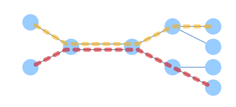
Preview:
Changelog:
v0.9.15 (02/06/2024)
- Fixed path drawing not being updated when edges in path prop are updated
v0.9.14 (12/20/2023)
- Fix not using the specified node position when restoring a deleted node.
v0.9.13 (11/12/2023)
- Bugfix
v0.9.11 (11/07/2023)
- Support for fitting graphs to the edge of the display area.
v0.9.10 (10/06/2023)
- Fixed an error when calculating a curve with two nodes in the same position
v0.9.9 (09/30/2023)
- Bugfix
v0.9.8 (09/14/2023)
- Performance improvement
v0.9.7 (08/18/2023)
- Add the ability to offset edge markers perpendicular to the line.
v0.9.6 (08/12/2023)
- Bugfix
v0.9.5 (07/04/2023)
- Add the ability to specify edge label config by lambda function.
v0.9.4 (06/26/2023)
- Add view.onBeforeInitialDisplay config to specify hook to be processed before initial display.
- Fix a bug that centering even though view.autoPanAndZoomOnLoad is false.
v0.9.3 (05/07/2023)
- Bugfix
v0.9.2 (05/06/2023)
- Add <v-style> component alternatives for <defs><component is=”style”> ~ </component></defs>.
- Modify d3-force layout simulation can be run with tick manually for static graph.
v0.9.1 (03/25/2023)
- Update
v0.8.2 (03/09/2023)
- Fix to fire view:pan event on initialization even if there is no change in position.
v0.8.1 (12/27/2022)
- Bugfix
v0.8.0 (12/12/2022)
- Automatic adjustment node label display position
- Node labels are displayed on a layer independent of the node
v0.7.0 (11/21/2022)
- Fix transitionWhile() not working properly
- Added exportAsSvgText() and exportAsSvgElement() functions to download SVGs with images embedded in data-uri(base6
v0.6.10 (09/25/2022)
- Remove “. /style.css” path mapping in package.json
v0.6.9 (09/20/2022)
- Support for self-loop edge display
v0.6.8 (09/04/2022)
- Fix unnecessary redraws and update notifications for nodes.
v0.6.7 (08/23/2022)
- Fix to avoid exception in path drawing when node position is not specified. This was occurring when the node position was not specified and the boundaries of the node needed to be calculated.
- Modify default size specification of the component to 0 specificity. It is easier to override the display size using css.
v0.6.6 (08/11/2022)
- Fix an issue where square ratios were unintentionally kept in the absence of an explicit css height specification.
- Remove style attribute from getAsSvg() result string.
v0.6.5 (07/12/2022)
- Fix a problem where changes in node positions could not be tracked, when the nodes were not present and the reference to layouts.nodes was overwritten
v0.6.4 (07/10/2022)
- Fix broken edge position calculation when replacing entire layouts.nodes
v0.6.3 (07/01/2022)
- Fix to not raise an error even if the node pointed to by the edge does not exist, in ForceLayout.
v0.6.2 (06/28/2022)
- Fix a bug in box-selection that the box remains when the cmd key is released before the mouse.
v0.6.1 (06/26/2022)
- Add a slot edge-overlay for drawing objects on edges.
- Add a config to start box selection mode with ctrl/cmd key (configs.view.boxSelectionEnabled).
- Bug Fix
v0.6.0 (06/20/2022)
- Add a feature to select nodes with a rectangle.
v0.5.19 (06/13/2022)
- Change to not block wheel event when zoom by mouse wheel is disabled.
- Change to not block touch operation when pan/zoom/draggable are all disabled.
v0.5.18 (06/07/2022)
- Add transitionWhile() method to <v-network-graph> instance.
v0.5.17 (05/26/2022)
- The width and height of a css can now be specified directly for <v-network-graph> component.
v0.5.16 (05/19/2022)
- Fixed an issue where, in a situation with multiple v-network-graph instances, if there is an edge marker with the same parameters and the forward instance is hidden with display:none, the edge marker of the back instance will disappear.
v0.5.15 (05/15/2022)
- Fix incorrect gap calculation between rectangular nodes and arrow-headed edges.
- Add getViewBox and setViewBox functions to get and set view area.
v0.5.14 (05/10/2022)
- Fix a problem where ForceLayout would detect any property change of the edge and recalculate force simulation.
v0.5.13 (04/24/2022)
- Change that dbl-click and wheel zoom are also disabled if view.zoomEnabled config is set to false.
v0.5.13 (04/24/2022)
- Fix an exception when deleting a node to which an edge is connected when edge type is “curve”.
v0.5.11 (04/17/2022)
- Fix: the focus ring was not shown when modifying selected-nodes
- Fix: double-clicking on a node would unexpectedly zoom in. (update @dash14/svg-pan-zoom library)
v0.5.10 (04/16/2022)
- Expose <v-shape /> components for the use case that specify raw event handlers to the nodes.
- Remove unnecessary event.preventDefault().
v0.5.9 (04/07/2022)
- Fix wheel events being propagated outside the graph area.
v0.5.8 (04/04/2022)
- Fix an issue where the view:click event would not work after view:contextmenu
v0.5.7 (03/22/2022)
- Fix an issue where right-clicking on node/edge/path would also trigger “view:contextmenu” event.
v0.5.5 (03/17/2022)
- Fix problem with multiple edge selection by touch
v0.5.4 (03/12/2022)
- Change to relax the movement detection threshold with touch
v0.5.3 (03/08/2022)
- Fix issue with onclick events not firing in mobile browsers
v0.5.2 (03/06/2022)
- Fix a bug that edge selected from the beginning did not become selected
v0.5.0 (02/22/2022)
- Add the ability to select paths.
- Add support for dynamically changing the appearance of a path when its hover/selection state changes.
- Add support for z-order control of paths as well as nodes and edges.
- Add support for catching new path-related events with event-handlers. “path:pointerover”, “path:pointerout”, “path:pointerdown”, “path:pointerup”, “path:select”
- Purge the dependency on victor (2D vector maths library).