Install & Download:
# Yarn
$ yarn add vue-superselect
# NPM
$ npm install vue-superselect
# PNPM
$ pnpm install vue-superselect
Description:
vue-superselect is a headless, accessible custom select and combobox component for Vue 3 that handles selection state, filtering, keyboard navigation, and ARIA attributes.
It comes with zero CSS, runs in strict TypeScript, and gives you two ways to build the interface: compound components or a composable with prop getters.
Features
- 🎨 Headless rendering: Every visual layer comes from your own classes applied to scoped slots.
- ♿ WAI-ARIA combobox: Implements the full ARIA combobox pattern with screen reader announcements via
SelectLiveRegion. - 🔢 Single and multi-select: Supports
v-modelwith themultipleprop, tag display,maxlimits, andhideSelected. - 🔍 Built-in filtering: Runs case-insensitive label matching by default. Accepts custom
FilterFnfunctions and adebouncedelay. Handles IME input safely. - 📐 Smart positioning: Connects to
@floating-ui/vuefor auto-flip and teleport support. Falls back to CSS absolute positioning when Floating UI is absent. - 🧩 Composable API: The
useSelect<T>()composable returns prop getters (getRootProps,getInputProps,getListboxProps,getOptionProps) for full DOM control. - 📦 Tree-shakeable builds: Outputs ESM and CJS with
sideEffects: falseand/*#__PURE__*/annotations. - ⌨️ Keyboard navigation: Arrow keys, Enter, Escape, Tab, Backspace, Home, and End.
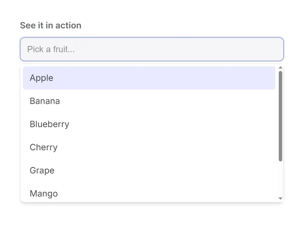
Preview
How to Use It
1. Install the Package in your project.
npm install vue-superselect2. For automatic dropdown placement with viewport collision detection, install @floating-ui/vue:
npm install @floating-ui/vueSkip this step if you plan to position the dropdown yourself via CSS. The library detects the presence of @floating-ui/vue at runtime and falls back to CSS absolute positioning when it is absent.
3. Set Up State with Composition API
<script setup>
import { ref } from 'vue'
import {
  SelectRoot,
  SelectControl,
  SelectInput,
  SelectContent,
  SelectOption,
} from 'vue-superselect'
const selected = ref(null)
const fruits = ['Apple', 'Banana', 'Cherry', 'Grape', 'Mango']
</script>
4. Or set up State with the Options API
<script>
import {
  SelectRoot,
  SelectControl,
  SelectInput,
  SelectContent,
  SelectOption,
} from 'vue-superselect'
export default {
  components: {
    SelectRoot,
    SelectControl,
    SelectInput,
    SelectContent,
    SelectOption,
  },
  data() {
    return {
      selected: null,
      fruits: ['Apple', 'Banana', 'Cherry', 'Grape', 'Mango'],
    }
  },
}
</script>
5. Build the Template:
<template>
  <SelectRoot v-model="selected">
    <SelectControl>
      <SelectInput placeholder="Pick a fruit..." aria-label="Fruit selector" />
    </SelectControl>
    <SelectContent>
      <SelectOption
        v-for="fruit in fruits"
        :key="fruit"
        :value="fruit"
        :label="fruit"
      >
        {{ fruit }}
      </SelectOption>
    </SelectContent>
  </SelectRoot>
</template>
Always attach an aria-label, aria-labelledby, or an associated <label> to SelectInput. A dev-only warning appears in the console when no label is detected.
6. Apply Your Own Styles:
<SelectControl class="border rounded-md px-3 py-2 focus-within:ring-2">
  <SelectInput class="w-full outline-none text-sm" />
</SelectControl>
<SelectContent class="mt-1 border rounded-md shadow-lg bg-white">
  <SelectOption
    v-for="fruit in fruits"
    :key="fruit"
    :value="fruit"
    :label="fruit"
    v-slot="{ selected, active }"
  >
    <span :class="[active ? 'bg-blue-100' : '', selected ? 'font-semibold' : '']">
      {{ fruit }}
    </span>
  </SelectOption>
</SelectContent>
7. Multi-Select with Tags:
<script setup>
import { ref } from 'vue'
import {
  SelectRoot,
  SelectControl,
  SelectInput,
  SelectContent,
  SelectOption,
  SelectTag,
} from 'vue-superselect'
const selected = ref([])
const colors = ['Red', 'Green', 'Blue', 'Yellow', 'Purple']
</script>
<template>
  <SelectRoot v-model="selected" :multiple="true" :max="3" :hideSelected="true">
    <SelectControl v-slot="{ selectedItems, removeItem }">
      <SelectTag
        v-for="item in selectedItems"
        :key="item.value"
        :value="item.value"
        :label="item.label"
        @remove="removeItem(item.value)"
      />
      <SelectInput placeholder="Add a color..." aria-label="Color selector" />
    </SelectControl>
    <SelectContent>
      <SelectOption
        v-for="color in colors"
        :key="color"
        :value="color"
        :label="color"
      >
        {{ color }}
      </SelectOption>
    </SelectContent>
  </SelectRoot>
</template>
8. Adding Floating UI Positioning. When @floating-ui/vue is installed, SelectContent picks it up automatically. You can control placement and collision behavior with props:
<SelectContent
  placement="bottom-start"
  collisionStrategy="flip"
  :teleport="true"
>
  <!-- options -->
</SelectContent>
Set teleport to true to mount the dropdown on document.body, or pass a CSS selector string to target a specific container. Use forceAbsolute to bypass Floating UI and fall back to standard CSS positioning.
9. Custom Filter Function with Debounce:
<script setup>
import { ref } from 'vue'
import { SelectRoot, SelectContent, SelectOption, SelectInput, SelectControl } from 'vue-superselect'
const selected = ref(null)
const items = ['React', 'Vue', 'Svelte', 'Angular', 'Solid']
function customFilter(item, query) {
  return item.label.toLowerCase().startsWith(query.toLowerCase())
}
</script>
<template>
  <SelectRoot v-model="selected" :filter="customFilter" :debounce="300">
    <SelectControl>
      <SelectInput placeholder="Search frameworks..." aria-label="Framework selector" />
    </SelectControl>
    <SelectContent>
      <SelectOption v-for="fw in items" :key="fw" :value="fw" :label="fw">
        {{ fw }}
      </SelectOption>
    </SelectContent>
  </SelectRoot>
</template>
Keyboard Navigation
| Key | Action |
|---|---|
Arrow Down / Up | Move focus through the option list |
Enter | Select the highlighted option |
Escape | Close the dropdown; press again to clear the search query |
Tab | Move focus out (or select the highlighted option when selectOnTab is true) |
Backspace | Remove the last tag in multi-select mode when the input is empty |
Home / End | Jump to the first or last option |
API Reference
SelectRoot Props
| Prop | Type | Default | Description |
|---|---|---|---|
modelValue | T | T[] | null | undefined | Controlled selected value. Bind with v-model. |
defaultValue | T | T[] | null | null | Initial value for uncontrolled usage. |
multiple | boolean | false | Activates multi-select mode. Requires modelValue to be an array. |
disabled | boolean | false | Disables all interaction across the entire select. |
items | T[] | undefined | Root-level data source as an alternative to SelectOption children. |
labelKey | keyof T | undefined | Object field used as the display label. |
valueKey | keyof T | undefined | Object field used as the v-model value. |
filter | FilterFn | undefined | Custom filter function. Defaults to case-insensitive label matching. |
debounce | number | undefined | Debounce delay in milliseconds for the filter function. |
resolveLabel | (value: T) => string | undefined | Resolves a display label for a selected value when option components are not mounted. |
selectOnTab | boolean | false | Selects the highlighted option when Tab is pressed. |
max | number | undefined | Maximum number of selections in multi-select mode. |
hideSelected | boolean | false | Hides already-selected options from the dropdown in multi-select mode. |
open | boolean | undefined | Controlled open state. Bind with v-model:open. |
defaultOpen | boolean | false | Initial open state for uncontrolled usage. |
loop | boolean | true | Wraps keyboard navigation from last to first option and vice versa. |
placeholder | string | undefined | Placeholder text on the input when no value is selected. |
id | string | auto-generated | Custom ID for the root element, used as base for ARIA IDs. |
SelectRoot Events
| Event | Payload | Description |
|---|---|---|
update:modelValue | T | T[] | null | Fires when the selected value changes. Used by v-model. |
update:open | boolean | Fires when the open state changes. Used by v-model:open. |
SelectRoot Exposed Methods
| Method | Signature | Description |
|---|---|---|
open | () => void | Opens the dropdown. |
close | () => void | Closes the dropdown. |
toggle | () => void | Toggles the dropdown open state. |
clear | () => void | Clears the selection and the search query. |
focus | () => void | Focuses the input element. |
SelectRoot TypeScript Types
type FilterFn<T> = (item: CollectionItem<T>, query: string) => boolean
interface CollectionItem<T> {
  id: string
  value: T
  label: string
  disabled: boolean
  element: HTMLElement | null
}
type SelectLabelResolver<T> = (value: T) => string | undefined
SelectControl Props & Slots
| Prop | Type | Default | Description |
|---|---|---|---|
as | string | Component | 'div' | The element or component to render as. |
The default slot receives { selectedItems, removeItem, multiple }:
| Slot Prop | Type | Description |
|---|---|---|
selectedItems | Array<{ value: T; label: string }> | Selected items with resolved labels (multi-select only). |
removeItem | (value: T) => void | Removes a specific item from the selection. |
multiple | boolean | Whether multi-select mode is active. |
SelectInput Props
| Prop | Type | Default | Description |
|---|---|---|---|
as | string | Component | 'input' | The element or component to render as. |
Always attach an accessible label via aria-label, aria-labelledby, or an associated <label>.
SelectContent Props
| Prop | Type | Default | Description |
|---|---|---|---|
as | string | Component | 'ul' | The element or component to render as. |
placement | string | 'bottom-start' | Preferred dropdown placement relative to the control. |
collisionStrategy | 'flip' | 'none' | 'flip' | How to handle viewport edge collisions. |
forceAbsolute | boolean | false | Disables Floating UI and uses CSS absolute positioning. |
teleport | boolean | string | false | Teleports the dropdown. true targets body; a string targets a CSS selector. |
Data attributes on SelectContent: data-side (top, bottom, left, right) and data-align (start, center, end).
SelectOption Props
| Prop | Type | Default | Description |
|---|---|---|---|
value | T | required | The value of this option. |
label | string | String(value) | Display label. Falls back to string conversion of value. |
disabled | boolean | false | Disables selection of this option. |
id | string | auto-generated | Custom ID for the option element. |
as | string | Component | 'li' | The element or component to render as. |
The default slot receives { selected, active, disabled, option }. Data attributes: data-selected, data-highlighted, data-disabled.
SelectTag Props & Events
| Prop | Type | Default | Description |
|---|---|---|---|
value | T | required | The value this tag represents. |
label | string | required | Display text for the tag. |
disabled | boolean | false | Disables the remove button. |
as | string | Component | 'span' | The element or component to render as. |
The remove event fires with the tag value as its payload. The default slot receives { value, label, disabled, remove }.
SelectTrigger Props
| Prop | Type | Default | Description |
|---|---|---|---|
as | string | Component | 'button' | The element or component to render as. |
Automatically sets aria-expanded and aria-controls. Typically contains a chevron icon.
SelectClear Props
| Prop | Type | Default | Description |
|---|---|---|---|
as | string | Component | 'button' | The element or component to render as. |
Resets both the current selection and the search query. Disables automatically when the select is disabled.
SelectEmpty Props
| Prop | Type | Default | Description |
|---|---|---|---|
as | string | Component | 'div' | The element or component to render as. |
Renders only when no options match the active filter query. Defaults to “No results”.
SelectLiveRegion Props
| Prop | Type | Default | Description |
|---|---|---|---|
messages | Partial<SelectMessages> | defaultSelectMessages | Custom message functions for screen reader announcements. |
interface SelectMessages {
  listExpanded: () => string
  listCollapsed: () => string
  resultsCount: (count: number) => string
  itemAdded: (label: string) => string
  itemRemoved: (label: string) => string
}
Default messages: "List expanded", "List collapsed", "3 results" (pluralized), "Added Apple", "Removed Apple".
The as Prop
Every component accepts an as prop to swap the rendered HTML element or pass a custom Vue component:
<!-- Render SelectContent as an <ol> -->
<SelectContent as="ol">
  <SelectOption as="li" :value="item" :label="item.name" />
</SelectContent>
<!-- Render SelectControl as a custom wrapper component -->
<SelectControl :as="MyCustomWrapper">
  <SelectInput aria-label="Search" />
</SelectControl>
FAQs
Q: Can I use vue-superselect with object arrays rather than plain string arrays?
A: Yes. Pass your array to the items prop on SelectRoot and set labelKey and valueKey to the corresponding object fields. The library uses those keys for display labels and v-model values. The FilterFn type also receives a fully typed CollectionItem<T> so your custom filter stays type-safe.
Q: What happens if I do not install @floating-ui/vue?
A: The library detects its absence at runtime and falls back to CSS absolute positioning. Set forceAbsolute to true on SelectContent to use absolute positioning explicitly, regardless of whether Floating UI is installed.
Q: How do I cap the number of selectable items in multi-select mode?
A: Set the max prop on SelectRoot. Once the selection reaches that count, additional options become non-selectable. Pair it with hideSelected to remove already-selected options from the dropdown list.
Q: How do I trigger the select open state from external code?
A: Use a template ref on SelectRoot and call the exposed open(), close(), or toggle() methods. Alternatively, bind v-model:open to a reactive boolean and control it from your component logic.
Q: Does the composable API support multi-select?
A: Yes. useSelect<T>() accepts the same configuration options as SelectRoot. Pass multiple: true in the options object and handle the value as a typed array in your own template.


