Install & Download:
# Yarn
$ yarn add vue-datepicker-next
# NPM
$ npm i vue-datepicker-next
Description:
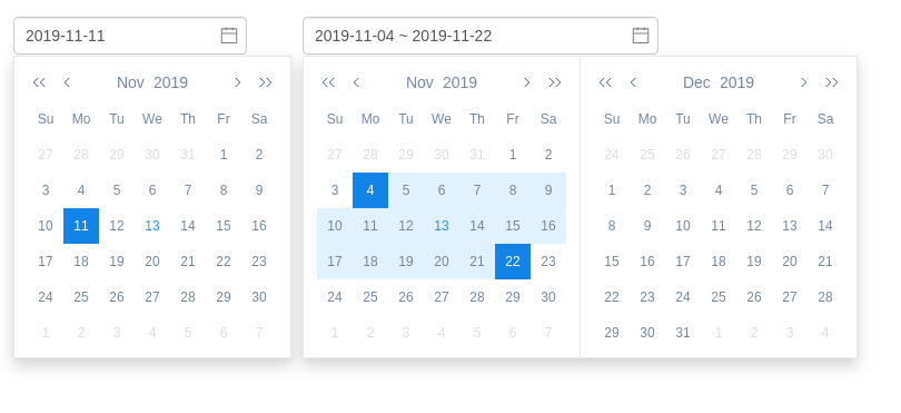
A versatile and multi-language date picker component allows you to select years, months, weeks, dates, times, and date ranges on a dropdown UI.
Vue 2 version is available here.
Basic usage:
1. Import the date picker component & its stylesheet.
import DatePicker from 'vue-datepicker-next';
import 'vue-datepicker-next/index.css';
// OPTIONAL local
import 'vue-datepicker-next/locale/es';
2. Register the component.
export default {
  components: { DatePicker },
  // ...
};
3. Add the component to the template.
<template>
  <div>
    <!-- Date Picker -->
    <date-picker v-model:value="time0"></date-picker>
    <!-- Datetime Picker -->
    <date-picker v-model:value="time1" type="datetime"></date-picker>
    <!-- Custom Format -->
    <date-picker v-model:value="time2" valueType="format"></date-picker>
    <!-- Date Range Picker -->
    <date-picker v-model:value="time3" range></date-picker>
  </div>
</template>
4. Available component props for the Picker component.
// date | datetime | year | month | time | week
type?: PickerType;
format?: string;
value?: DateValue;
// date | timestamp | format | token(MM/DD/YYYY)
valueType?: Valuetype;
formatter?: Formatter;
lang?: string | DeepPartial<Locale>;
prefixClass?: string;
appendToBody?: boolean;
open?: boolean;
popupClass?: ClassValue;
popupStyle?: StyleValue;
confirm?: boolean;
confirmText?: string;
shortcuts?: Array<{ text: string; onClick: () => Date | Date[] }>;
disabledDate?: (v: Date) => boolean;
disabledTime?: (v: Date) => boolean;
onClose?: () => void;
onOpen?: () => void;
onConfirm?: (v: any) => void;
onChange?: (v: any, type?: string) => void;
['onUpdate:open']?: (open: boolean) => void;
['onUpdate:value']?: (v: any) => void;
// date picker components
range: true;
Preview:
Changelog:
v1.0.3 (03/13/2023)
- Bug Fixes


