Install & Download:
# Yarn
$ yarn add @vuepic/vue-datepicker
# NPM
$ npm i @vuepic/vue-datepicker --save
Description:
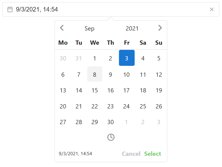
A Vue. 3 component for creating time pickers, date pickers, month pickers, year pickers, and date range pickers in your app.
Features:
- Dark & Light themes.
- Accessibility.
- SSR support.
- Multiple languages.
- Timezones.
- Week numbers.
- Highly customizable.
How to use it:
1. Import and register the component.
import Datepicker from 'vue3-date-time-picker';
import 'vue3-date-time-picker/dist/main.css'
// globally
import { createApp } from "vue";
import App from './App.vue';
const app = createApp(App);
app.component('Datepicker', Datepicker);
app.mount('#app');
// locally
<template>
<Datepicker v-model="date"></Datepicker>
</template>
<script>
import Datepicker from 'vue3-date-time-picker';
import 'vue3-date-time-picker/dist/main.css'
export default {
components: { Datepicker },
data() {
return {
date: null,
};
}
}
</script>// With Composition API
<template>
<Datepicker v-model="date"></Datepicker>
</template>
<script>
import { ref } from 'vue';
import Datepicker from 'vue3-date-time-picker';
import 'vue3-date-time-picker/dist/main.css'
export default {
components: { Datepicker },
setup() {
const date = ref();
return {
date
}
}
};
</script>2. Default props.
multiCalendars: { type: [Boolean, Number, String, Object] as PropType<MultiCalendarsProp>, default: undefined },
modelValue: { type: [String, Date, Array, Object, Number] as PropType<ModelValue>, default: null },
modelType: { type: String as PropType<ModelType>, default: null },
position: { type: String as PropType<OpenPosition>, default: 'center' },
dark: { type: Boolean as PropType<boolean>, default: false },
format: {
  type: [String, Function] as PropType<IFormat>,
  default: () => null,
},
autoPosition: { type: Boolean as PropType<boolean>, default: true },
altPosition: { type: Function as PropType<CustomAltPosition>, default: null },
transitions: { type: [Boolean, Object] as PropType<boolean | Partial<Transition>>, default: true },
formatLocale: { type: Object as PropType<Locale>, default: null },
utc: { type: [Boolean, String] as PropType<boolean | 'preserve'>, default: false },
ariaLabels: { type: Object as PropType<Partial<AriaLabels>>, default: () => ({}) },
offset: { type: [Number, String] as PropType<number | string>, default: 10 },
hideNavigation: { type: Array as PropType<Flow[]>, default: () => [] },
timezone: { type: String as PropType<string>, default: null },
emitTimezone: { type: String as PropType<string>, default: null },
vertical: { type: Boolean as PropType<boolean>, default: false },
disableMonthYearSelect: { type: Boolean as PropType<boolean>, default: false },
disableYearSelect: { type: Boolean as PropType<boolean>, default: false },
menuClassName: { type: String as PropType<string>, default: null },
dayClass: { type: Function as PropType<(date: Date) => string>, default: null },
yearRange: { type: Array as PropType<number[]>, default: () => [1900, 2100] },
calendarCellClassName: { type: String as PropType<string>, default: null },
enableTimePicker: { type: Boolean as PropType<boolean>, default: true },
autoApply: { type: Boolean as PropType<boolean>, default: false },
disabledDates: { type: [Array, Function] as PropType<Date[] | string[] | IDisableDates>, default: () => [] },
monthNameFormat: { type: String as PropType<'long' | 'short'>, default: 'short' },
startDate: { type: [Date, String] as PropType<string | Date>, default: null },
startTime: { type: [Object, Array] as PropType<TimeModel | TimeModel[] | null>, default: null },
hideOffsetDates: { type: Boolean as PropType<boolean>, default: false },
autoRange: { type: [Number, String] as PropType<number | string>, default: null },
noToday: { type: Boolean as PropType<boolean>, default: false },
disabledWeekDays: { type: Array as PropType<string[] | number[]>, default: () => [] },
allowedDates: { type: Array as PropType<string[] | Date[]>, default: null },
nowButtonLabel: { type: String as PropType<string>, default: 'Now' },
markers: { type: Array as PropType<IMarker[]>, default: () => [] },
escClose: { type: Boolean as PropType<boolean>, default: true },
spaceConfirm: { type: Boolean as PropType<boolean>, default: true },
monthChangeOnArrows: { type: Boolean as PropType<boolean>, default: true },
presetDates: { type: Array as PropType<PresetDate[]>, default: () => [] },
flow: { type: Array as PropType<Flow[]>, default: () => [] },
partialFlow: { type: Boolean as PropType<boolean>, default: false },
preventMinMaxNavigation: { type: Boolean as PropType<boolean>, default: false },
minRange: { type: [Number, String] as PropType<number | string>, default: null },
maxRange: { type: [Number, String] as PropType<number | string>, default: null },
multiDatesLimit: { type: [Number, String] as PropType<number | string>, default: null },
reverseYears: { type: Boolean as PropType<boolean>, default: false },
weekPicker: { type: Boolean as PropType<boolean>, default: false },
filters: { type: Object as PropType<Partial<DateFilter>>, default: () => ({}) },
arrowNavigation: { type: Boolean as PropType<boolean>, default: false },
disableTimeRangeValidation: { type: Boolean as PropType<boolean>, default: false },
highlight: {
  type: [Array, Function, Object] as PropType<HighlightProp>,
  default: null,
},
highlightWeekDays: {
  type: Array as PropType<number[]>,
  default: null,
},
highlightDisabledDays: { type: Boolean as PropType<boolean>, default: false },
teleport: { type: [String, Boolean] as PropType<string | boolean>, default: null },
teleportCenter: { type: Boolean as PropType<boolean>, default: false },
locale: { type: String as PropType<string>, default: 'en-Us' },
weekNumName: { type: String as PropType<string>, default: 'W' },
weekStart: { type: [Number, String] as PropType<WeekStartNum | WeekStartStr>, default: 1 },
weekNumbers: {
  type: [String, Function] as PropType<'iso' | 'local' | ((date: Date) => string | number)>,
  default: null,
},
calendarClassName: { type: String as PropType<string>, default: null },
monthChangeOnScroll: { type: [Boolean, String] as PropType<boolean | 'inverse'>, default: true },
dayNames: {
  type: [Function, Array] as PropType<((lang: string, weekStart: number) => string[]) | string[]>,
  default: null,
},
monthPicker: { type: Boolean as PropType<boolean>, default: false },
customProps: { type: Object as PropType<Record<string, unknown>>, default: null },
yearPicker: { type: Boolean as PropType<boolean>, default: false },
modelAuto: { type: Boolean as PropType<boolean>, default: false },
selectText: { type: String as PropType<string>, default: 'Select' },
cancelText: { type: String as PropType<string>, default: 'Cancel' },
previewFormat: {
  type: [String, Function] as PropType<IFormat>,
  default: () => '',
},
multiDates: { type: Boolean as PropType<boolean>, default: false },
partialRange: { type: Boolean as PropType<boolean>, default: true },
ignoreTimeValidation: { type: Boolean as PropType<boolean>, default: false },
minDate: { type: [Date, String] as PropType<Date | string>, default: null },
maxDate: { type: [Date, String] as PropType<Date | string>, default: null },
minTime: { type: Object as PropType<TimeModel>, default: null },
maxTime: { type: Object as PropType<TimeModel>, default: null },
name: { type: String as PropType<string>, default: null },
placeholder: { type: String as PropType<string>, default: '' },
hideInputIcon: { type: Boolean as PropType<boolean>, default: false },
clearable: { type: Boolean as PropType<boolean>, default: true },
state: { type: Boolean as PropType<boolean | null>, default: null },
required: { type: Boolean as PropType<boolean>, default: false },
autocomplete: { type: String as PropType<string>, default: 'off' },
inputClassName: { type: String as PropType<string>, default: null },
fixedStart: { type: Boolean as PropType<boolean>, default: false },
fixedEnd: { type: Boolean as PropType<boolean>, default: false },
timePicker: { type: Boolean as PropType<boolean>, default: false },
enableSeconds: { type: Boolean as PropType<boolean>, default: false },
is24: { type: Boolean as PropType<boolean>, default: true },
noHoursOverlay: { type: Boolean as PropType<boolean>, default: false },
noMinutesOverlay: { type: Boolean as PropType<boolean>, default: false },
noSecondsOverlay: { type: Boolean as PropType<boolean>, default: false },
hoursGridIncrement: { type: [String, Number] as PropType<string | number>, default: 1 },
minutesGridIncrement: { type: [String, Number] as PropType<string | number>, default: 5 },
secondsGridIncrement: { type: [String, Number] as PropType<string | number>, default: 5 },
hoursIncrement: { type: [Number, String] as PropType<number | string>, default: 1 },
minutesIncrement: { type: [Number, String] as PropType<number | string>, default: 1 },
secondsIncrement: { type: [Number, String] as PropType<number | string>, default: 1 },
range: { type: Boolean as PropType<boolean>, default: false },
uid: { type: String as PropType<string>, default: null },
disabled: { type: Boolean as PropType<boolean>, default: false },
readonly: { type: Boolean as PropType<boolean>, default: false },
inline: { type: [Boolean, Object] as PropType<InlineProp>, default: false },
textInput: { type: [Boolean, Object] as PropType<TextInputProp>, default: false },
noDisabledRange: { type: Boolean as PropType<boolean>, default: false },
sixWeeks: { type: [Boolean, String] as PropType<boolean | SixWeekMode>, default: false },
actionRow: { type: Object as PropType<Partial<ActionRowData>>, default: () => ({}) },
focusStartDate: { type: Boolean as PropType<boolean>, default: false },
disabledTimes: { type: [Function, Array] as PropType<DisabledTimeArrProp>, default: undefined },
showLastInRange: { type: Boolean as PropType<boolean>, default: true },
timePickerInline: { type: Boolean as PropType<boolean>, default: false },
calendar: { type: Function as PropType<(month: ICalendarDate[]) => ICalendarDate[]>, default: null },
config: { type: Object as PropType<Partial<Config>>, default: undefined },
quarterPicker: { type: Boolean as PropType<boolean>, default: false },
yearFirst: { type: Boolean as PropType<boolean>, default: false },
Preview:
Changelog:
v8.4.0 (04/06/2024)
- Added support for iso format in model-type
- Added top-extra slot
- Added a second parameter in the internal-model-change event with a matching value in v-model
- Fixed issue with disabled flag on wrapper div causing unwanted behavior in Quasar framework
- Fixed wrong borders when hovering weeks in between on ranged week-picker
- Fixed issue with wrong classes applied in range mode including missing start and end range classes
- Refactor
v8.3.2 (04/02/2024)
- Pass the format-locale prop when parsing custom model-type
- Bugfixes
v8.3.1 (03/17/2024)
- Bugfixes
v8.3.0 (03/17/2024)
- Added support for dragging and selecting on multi-dates
- timezone prop can now accept convertModel property
- Revert v-model to timezone conversion before v8.1.0
- Deprecated prop multi-dates-limit
- Bugfixed
v8.2.0 (03/01/2024)
- Add weekDay property to aria-labels prop
- Bugfixes
v8.1.1 (02/13/2024)
- Bug Fixes
v8.1.0 (02/11/2024)
- The timezone prop is extended with the configuration object
- Added fixedStart and fixedEnd range support to month-picker
- Bug Fixes
v8.0.0 (02/03/2024)
- Added dp–past and dp–future classes in the calendar
- Added range support for week-picker
- Added loading prop that adds loading overlay in the menu
- Added minMaxRawRange in the range configuration object
- Bug Fixes
v7.4.1 (01/08/2024)
- Transition for menuAppear is now working with teleport
- Bugfixes
v7.4.0 (12/07/2023)
- Exposed openMenu, closeMenu and toggleMenu functions to the dp-input slot
- Bug Fixes
- Added debounce on month-change-on-scroll
- Added conditional operators on global event listeners
v7.2.2 (11/07/2023)
- Bugfixes
v7.2.1 (11/04/2023)
- Added id attribute to date cells in the calendar
- Reduced bundle size
- Bugfixed
v7.2.0 (10/15/2023)
- Added invalid-date event
- Added year-first prop
- Additional configuration is now possible for highlight prop
- Added 3 additional CSS variables for range styling
- Fixed the issue causing the overlay grid to overflow when the height changes
- Fixed missing –dp-hover-text-color CSS variable on preset range button
- highlightWeekDays and highlightDisabledDays props are deprecated
- Array type for highlight prop is deprecated
v7.1.0 (10/06/2023)
- New event added date-update
- Bug Fixes
v7.0.0 (09/30/2023)
- Added quarter-picker mode
- Added built-in date validation support for text-input
- Added utc mode support for week-picker
- Added disabled times indications when validating range start/end times
- Added new option selectOnFocus for text-input
- Bug Fixes
v6.1.0 (09/10/2023)
- Added config prop, grouping general configuration
- Bug Fixes
v6.0.3 (09/02/2023)
- Lots of bugs fixed
- Added aria-disabled and aria-invalid attributes on the input field
v6.0.2 (08/26/2023)
- Lots of bugs fixed
v6.0.1 (08/19/2023)
- Extend disabled-times prop config for more accessible range validation
- Bugfixes
v6.0.0 (08/16/2023)
- Added multi-calendars support for month-picker
- New event added: @update:model-timezone-value
- New prop emit-timezone added
- Extended disabled-times prop with array option for dynamic disabling of times
- Full menu transition control added
- Added support for vue/compact
- Added mobile layout for preset-dates
- Support for RTL languages
- Added support for a single date in preset-dates
- Bug Fixes
v5.4.0 (07/01/2023)
- Extend the format-locale prop to have priority over locale prop
- onInput function exposed to dp-input slot, can now accept string value too
- New slot marker added
- Bug Fixes
v5.3.0 (06/17/2023)
- Added time-picker-inline prop to show time-picker under the calendar
- Added auto-apply-month prop to enable/disable auto month/year select in month-picker mode
- Added calendar prop to modify calendar view
- Bug Fixes
v5.2.1 (06/11/2023)
- bugfixes
v5.2.0 (06/03/2023)
- focus-start-date – Always set the view on a given date ignoring v-model value
- New method added switch-view to manually trigger overlay
- disabled-times prop added
- sidebar-[left/right] now have additional props passed
- close-on-clear-value – Option to disable menu close on clear
- New events added range-start and range-end
- Bug Fixes
v5.1.2 (05/19/2023)
- Bug Fixes
v5.1.1 (05/16/2023)
- dp-input slot now has exposed the isMenuOpen prop
- Bugfixes
v5.1.0 (05/13/2023)
- New events: time-picker-close and am-pm-change
- New prop: disable-year-select
- Bug Fixes
v5.0.1 (05/02/2023)
- Set type=”button” on <button> elements
- Fix types exports in TS
v5.0.0 (05/02/2023)
- Now button is moved to the action row
- sass variables and import are removed
- Renames: now-button slot is renamed to action-extra
- Renames: action-select slot is renamed to action-buttons
- prevenDefault is not called on mousedown | pointerdown events anymore in the menu (needs to be set explicitly)
- New prop action-row
- dp-input slot now has exposed all internal input functions
- six-weeks support for multiple options
- Bug Fixes
v4.5.1 (04/24/2023)
- Bugfix
v4.5.0 (04/22/2023)
- Revert auto-generating declarations
- Exported DatepickerInstance type for usage with ref
- Action row redesign
- Bugfix
v4.4.0 (04/16/2023)
- Option to override sass with plain CSS variables
- Added onBlur param to the dp-input slot
- New method parseModel is added for manually trigger reformating or parsing value
- Bug Fixes
- Refactor
v4.3.0 (04/02/2023)
- Added multi-dates support for month-picker
- Bugfixes
v4.2.3 (03/25/2023)
- Bugfixes
v4.2.2 (03/19/2023)
- Bugfixes
v4.2.1 (03/15/2023)
- Bugfixes
v4.2.0 (03/04/2023)
- New event time-picker-open
- Bug Fixes
v4.1.0 (03/01/2023)
- Expose handleMonthYearChange function to [left/right]-sidebar slots
- teleport prop is returned and can be used instead of DOM-ordered placement for behavior prior to v4
- partial-flow: auto-select value with auto-apply and not wait for the last step to be executed
- Bug Fixes
- Redundant background from the action-row is removed
v4.0.1 (02/17/2023)
- Bugfixes
v4.0.0 (02/16/2023)
- Datepicker will use regular DOM order to place the menu instead of the teleport
- teleport prop is removed
- alt-position boolean prop is removed
- Custom components props are removed
- week-numbers prop is extended to support custom function and local mode, boolean value is removed
- Bug Fixes
- tooltip-[open/close] event will send full marker object
v3.6.8 (02/08/2023)
- New events added [open/close]-tooltip and invalid-fixed-range
- model-type will now work with month-picker and time-picker
- Allow partial parsing on range text-input
- Overlay button will not overlap content in overlays
- Bug Fixes
v3.6.7 (02/01/2023)
- Revert date-fns-tz update
v3.6.6 (02/01/2023)
- Bugfixes
- Mark times outside min and max time disabled
v3.6.5 (01/15/2023)
- New method to programmatically set month and year view
- Bug Fixes
- Expose disabled state to action-row slot
- Respect flow on auto-apply
- Added support for prevent-min-max-navigation in month-picker mode
v3.6.4 (01/02/2023)
- Make disabled-dates work with month-picker
- Bug Fixes
v3.6.3 (12/11/2022)
- Reverted type declarations into index.d.ts because the JetBrains IDEs do not recognize the auto-generated ones.
v3.6.2 (12/11/2022)
- New slots added [month/year]-overlay and [month/year]-overlay-header (#211)
v3.6.1 (12/06/2022)
- bugfixes
v3.6.0 (12/01/2022)
- timezone – Support for timezones
- no-disabled-range – Prevent range selection if the range includes disabled dates
- textInputOptions.format to display the given format on input focus and global format for value display
- on-click-outside – Custom on click outside handler with exposed validation function
- six-weeks – Always display six weeks in the calendar
- New slots – month-year, time-picker, action-row
- Bug Fixes
v3.5.3 (11/01/2022)
- hideNavigation – Allows hiding navigation buttons from month/year/time overlays
- Bugfixes
v3.5.2 (10/09/2022)
- Fixed wrong positioning
v3.5.1 (10/08/2022)
- Bug Fixes
v3.5.0 (10/01/2022)
- dayClass – Pass custom classes to the specific calendar days
- Extended presetRanges to pass a custom slot
- highlightDisabledDays – Keep disabled dates highlighted if enabled
- Extended markers to accept html string
- New slots added left-sidebar and right-sidebar
- updateInternalModelValue – New method to update internal model-value while the picker is in open state
- Bug Fixes
v3.4.8 (09/11/2022)
- Bug Fixes
- Mark navigation buttons as disabled if preventMinMaxNavigation is enabled
- Accessibility – Use the spacebar also to mark selection
v3.4.7 (09/01/2022)
- highlightWeekDays – highlight days based on the day of the week
- ignoreTimeValidation – disables the time check when using minDate or maxDate
v3.4.6 (08/19/2022)
- Fixed issue that fails to load proper build format
- Use .cjs and .js for build formats
- Updated installation step in installation instructions for nuxt
v3.4.5 (08/16/2022)
- Fix malformed scss
v3.4.4 (08/15/2022)
- Bugfixes
v3.4.3 (08/14/2022)
- teleportCenter – Sets the menu on the page center
- Add “type”: “module” to package.json for Vite and SSR build
- Fixed positioning issue on small screens
- Expose class dp__cell_highlight_active when selection is active on highlighted date
v3.4.2 (08/13/2022)
- Added option to specify multiple patterns for parsing date on text-input
- offset – Configure spacing between the menu and input
- Fixed issue with nuxt throwing error in production build
- Refactor Menu to auto open on text input if openMenu is set in textInputOptions to true
- Build size reduced
v3.4.1 (08/07/2022)
- Fixed issue that causes the menu to close when used inside vuetify and quasar modals
- Refactor @invalid-select to emit if the selection is invalid from the action row
- Refactor Add preventDefault on enter key when input is focused
v3.4.0 (08/01/2022)
- Extend yearPicker to support range
- Extend utc to support the same UTC value input/output
- Extend sidebar option for presetDates with style property
- New event added invalid-select
- highlight – Option to highlight dates
- Bug Fixes
- Refactor – maxRange and minRange to ignore disabledDates in count
- Refactor – Timepicker will include minDate and maxDate time into the validation
- Refactor – Disable the select button in incomplete range with partialRange disabled
v3.3.1 (07/06/2022)
- Fixed issue with multiDates emitting only 2 dates
- Fixed issue with browser warnings for non-passive event listener
v3.3.0 (07/02/2022)
- @updateMonthYear event will now emit { instance: number; month: number; year: number } instead of two separate events
- monthYearComponent now needs to emit only the update-month-year event instead of two separate events for month and year
- dayNames – Pass custom labels for weekdays in the calendar header
- modelType – Specify custom type for v-model binding
- modelAuto – Use both singe and range modes
- Bug Fixes
v3.2.2 (06/04/2022)
- disableTimeRangeValidation – Explicitly allow end time in range mode to be before the start time
- Fixed issue with maxDate in monthPicker mode
- Fixed issue with the required input attribute not detected on form submit
- Set calendar (when using multiCalendars) view on the selected range when it is opened
v3.2.1 (05/14/2022)
- Calendar icon in the input field will also trigger a click event
- Text input validation is redone
- Allow multiCalendars view change based on external v-model update by providing :multiStatic=”false”
- Bugfix
v3.2.0 (05/01/2022)
- arrowNavigation – Navigate through the calendar via arrow keys
- flow now supports timePicker and monthPicker modes
- New event added focus-prev to handle shift+tab
- New mode – yearPicker
- Added validation for disabled dates with textInput
- Bug Fixes
v3.1.1 (04/16/2022)
- Fixed transition prop validation
- Corrected misspelled class name db__calendar_header to dp__calendar_header
v3.1.0 (04/10/2022)
- Added swipe events for touch devices, (can be disabled by passing noSwipe prop)
- vertical – New mode added, instead of going left/right, it will be up/down orientation
- New transition added on menu open
- ariaLabels – Option to change aria-labels text
- Bug Fixes
- Code cleanup, removed redundant code, better organization
- Use Symbol for injected props
- teleport to accept HTMLElement
- Improved and smoother transitions
- Positioning is redone, if autoPosition is enabled, it will auto fit to screen, x or y-axis
v3.0.0 (03/20/2022)
- scss import is changed to @vuepic/vue-datepicker/src/VueDatePicker/style/main.scss
- If you used the component in the html <script> tag, component name is changed to just VueDatePicker
- Bug fixes
- Use vite as a build tool
- The playground is moved to StackBlitz
- The component folder is renamed to VueDatePicker
v2.8.0 (03/12/2022)
- Added event updateMonthYear when month or year is changed
- multiDatesLimit – Limit selectable dates in multiDates mode
- range mode is now compatible with month picker
- weekPicker mode added
- keepActionRow – Option to keep action bar when autoApply is set
- reverseYears – Option to reverse years order
- Bug Fixes
v2.7.0 (02/23/2022)
- utc – Support for UTC zone
- Bug Fixes
- Refactor option to use clear-icon slot with the dp-input slot
- onClear event added to the dp-input slot params
- Cleaned up some redundant code
v2.5.0 (01/29/2022)
- twoCalendars renamed to multiCalendars
- twoCalendarsSolo renamed to multiCalendarsSolo
- New CSS variable added for menu border-color
- multiCalendars – allow adding multiple calendars
- inlineWithInput – option to use input field with inline
- Option to add name attribute to the input element
- @recalculatePosition – event added when menu position is recalculated
- Option to add autocomplete attribute to the input element
- Option to pass a custom positioning function to the altPosition
- Bug Fixes


