Install & Download:
# Yarn
$ yarn add mosha-vue-toastify
# NPM
$ npm i mosha-vue-toastify
Description:
A lightweight yet fully configurable Vue notification library for creating toasts and snackbars on apps.
How to use it:
1. Import necessary components.
import { defineComponent } from 'vue'
import { createToast } from 'mosha-vue-toastify';
import 'mosha-vue-toastify/dist/style.css';
2. Enable a button to display a basic notification.
<template>
  <button @click="toast">Click Me</button>
</template>
export default defineComponent({
  name: 'myApp',
  setup () {
    const toast = () => {
      createToast('Basic Toast.')
    }
    return { toast }
  }
})
3. Add a title to the toast message.
createToast({
  title: 'Toast title',
  description: 'Toast description'
})
4. Available customization options.
createToast({
title: 'Toast title',
description: 'Toast description'
},{
type: 'default', // 'info', 'danger', 'warning', 'success', 'default'
timeout: 5000,
showCloseButton: true,
position: 'top-right', // 'top-left', 'top-right', 'bottom-left', 'bottom-right', 'top-center', 'bottom-center'
transition: 'bounce',
hideProgressBar: false,
swipeClose: true,
toastBackgroundColor: '#fafafa',
onClose: null
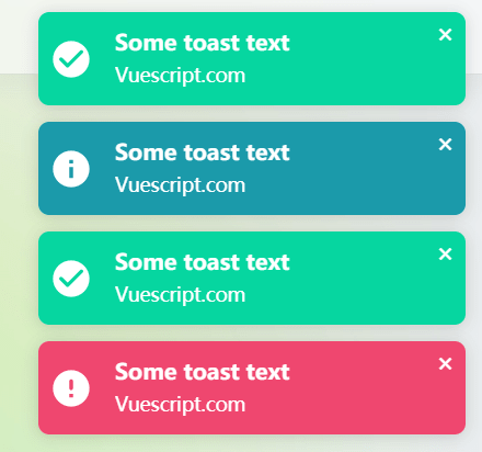
})Preview:
Changelog:
v1.0.23 (09/19/2021)
- Fixed: Toasts overlap each other when done in a ‘for’-ish type loop
v1.0.21 (08/30/2021)
- chore: prevent touch-scroll event with css, set touchstart as passive
v1.0.19 (08/16/2021)
- chore: update the text position
v1.0.18 (08/05/2021)
- update
v1.0.17 (07/12/2021)
- feat: exposing withProps function to accept props for custom component, parse html in description
v1.0.12 (06/14/2021)
- bugfix
v1.0.11 (04/26/2021)
- fix: bugfix on swipe


