Install & Download:
# NPM
$ npm i @kouts/vue-modal --save
Description:
vue-modal is a tiny, responsive, animated, accessible, and stackable modal window solution for Vue.js powered web app.
More Features:
- Opens and closes with a data variable using
v-model - Includes sensible default styling but it’s also highly customizable via user CSS classes and styles
- Override modal title and content via slots
- Modal intro and outro effects using CSS animation classes
- Exposes Component events – before-open, opening, after-open, before-close, after-close
- Scrollable when it’s contents exceed screen height
- Closeable by clicking on the upper right “x”, the overlay or the
esckey - Ability to set initial focus on an element when the modal window opens, just set the autofocus attribute on an element inside the modal
- Focus management trapps keyboard focus – tabbed navigation inside the modal window
- Ability to have unclosable modal windows
- Render on demand or stay always in DOM with “live” mode
- Modals appended to
<body>by default, ability to append to a custom element
See Also:
How to use it:
1. Import the vue-modal and necessary stylesheet into your project.
import VueModal from '@kouts/vue-modal';
import '@kouts/vue-modal/dist/vue-modal.css';
2. Register the modal component.
// globally
Vue.component('Modal', VueModal);
// locally
new Vue({
    components: {
      'Modal': VueModal
    }
})
3. Create a basic modal component in the app.
<button type="button" @click="showModal=true">
  Launch
</button>
<Modal v-model="showModal" title="Modal Title">
  <p>This is a modal</p>
</Modal>
new Vue({
    data: {
      showModal: false
    }
});
4. Default component props to customize the modal window.
title: {
type: String,
default: ''
},
baseZindex: {
type: Number,
default: 1051
},
bgClass: {
type: String,
default: ''
},
wrapperClass: {
type: String,
default: ''
},
modalClass: {
type: String,
default: ''
},
modalStyle: {
type: Object,
default: () => ({})
},
inClass: {
type: String,
default: 'vm-fadeIn'
},
outClass: {
type: String,
default: 'vm-fadeOut'
},
bgInClass: {
type: String,
default: 'vm-fadeIn'
},
bgOutClass: {
type: String,
default: 'vm-fadeOut'
},
appendTo: {
type: String,
default: 'body'
},
live: {
type: Boolean,
default: false
},
enableClose: {
type: Boolean,
default: true
},
basedOn: {
type: Boolean,
default: false
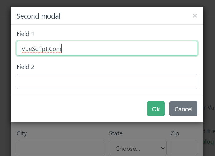
}Preview:
Changelog:
v2.1.12 (06/05/2023)
- Bug Fixes
v2.1.11 (11/06/2022)
- Bug Fixes
v2.1.10 (10/02/2022)
- Bug Fixes
v2.1.9 (07/21/2022)
- Bug Fixes
v2.1.8 (06/16/2022)
- Bug Fixes
v2.1.7 (04/18/2022)
- fixed features test setup
v2.1.5 (04/16/2022)
- Bug Fixes
v2.1.1 (10/26/2021)
- add aria-label to first close button
v2.0.9 (05/11/2021)
- Moved Vue to dependencies
v2.0.8 (05/09/2021)
- Update
v2.0.7 (05/05/2021)
- Update
v2.0.5 (04/19/2021)
- Added data attribute to modal dialog
v2.0.4 (04/18/2021)
- Refactor getWrappers to return only visible elements