Install & Download:
# NPM
$ npm i vue3-dropdown-navbar
Description:
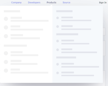
A customizable, responsive, multi-level dropdown bavbar component styled with Tailwind CSS.
How to use it:
1. Import and register the component.
// App.vue
<script setup lang="ts">
import {
  TheDropDownNavbar,
  TheDropDownMenu,
  TheDropDownItem,
  TheDropDownDivideBlock,
  TheDropDownNavbarLogo,
} from "vue3-dropdown-navbar";
import { ref } from "vue";
const dropdownMenu = ref<InstanceType<typeof TheDropDownMenu>>();
const toggleDarkMode = () => {
  document.documentElement.classList.toggle("dd-nav-dark");
};
</script>
2. The required HTML structure for the dropdown navbar.
<template>
  <TheDropDownNavbar>
    <template #logo>
      <TheDropDownNavbarLogo>Vue3 DropDown Navbar</TheDropDownNavbarLogo>
    </template>
    <TheDropDownItem link="/home">Home</TheDropDownItem>
    <TheDropDownMenu text="Dropdown 1" ref="dropdownMenu">
      <TheDropDownItem>Dropdown Item 1</TheDropDownItem>
      <TheDropDownItem>Dropdown Item 2</TheDropDownItem>
      <TheDropDownMenu text="Dropdown Item 3">
        <TheDropDownItem>Dropdown Item 3-1</TheDropDownItem>
        <TheDropDownItem>Dropdown Item 3-2</TheDropDownItem>
      </TheDropDownMenu>
      <TheDropDownDivideBlock>
        <TheDropDownItem>Sign out</TheDropDownItem>
      </TheDropDownDivideBlock>
    </TheDropDownMenu>
    <TheDropDownItem @click="toggleDarkMode">Toggle Dark Mode</TheDropDownItem>
  </TheDropDownNavbar>
  <button
    class="border bg-blue-500 text-white px-4 py-2 rounded-lg"
    @click="dropdownMenu?.openDropdownMenu"
  >
    Open Dropdown Menu
  </button>
</template>
3. Available TheDropDownItem props.
type Props = {
  // set link
  link?: string;
  // use the native a link
  native?: boolean;
};
4. Available TheDropDownMenu props.
type Props = {
  // custom text
  text: string;
  // close other menus
  closeOthers?: boolean;
};
5. Available TheDropDownNavbarLogo props.
type Props = {
  // link
  link?: string;
  // image alt
  alt?: string;
  // image url
  imageUrl?: string;
  // use the native a link
  native?: boolean;
};
6. Enable dark mode by adding the dd-nav-dark class to html tag.
Preview: