Vue.js modal components enable you to display overlays for images, forms, alerts, and dynamic content on top of the main application UI. Modal windows remain a fundamental UI pattern in modern web applications, but choosing the right implementation affects both user experience and development velocity.
This collection ranks 10 Vue.js modal components based on three objective metrics: GitHub stars (measuring community adoption), recent update activity (indicating active maintenance), and page views on VueScript.com over the past year (reflecting real-world developer interest). Each component offers distinct technical approaches, from renderless patterns to promise-based APIs, with varying levels of customization and built-in styling.
The components below address specific use cases. Some help you create mobile bottom sheets, others provide advanced focus management, and several offer minimal footprints for performance-conscious projects. Browse the list to identify the best Vue.js modal components that meet your web dev requirements.
Originally published Nov 17 2017, updated Dec 25 2025
1. Mobile-friendly Modal Popup Library For Vue – Final Modal
A tiny, elegant, renderless, mobile-friendly, feature-rich modal window component for Vue.js 3/2.
Features:
- SSR support
- Stackable
- Detachable
- Scrollable
- Smooth Transitions
2. Simple Modal Component For Vue 3 – Jenesius
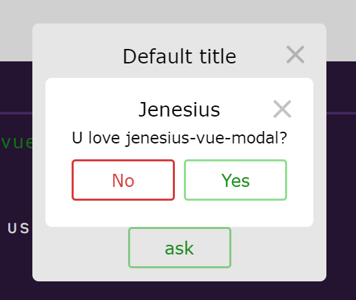
Just another modal & dialog component for Vue 3 applications.
Features:
- Just put ModalContainer and then open any components like modal windows.
- This library don’t add any design rules. You can use your components with your css classes.
- There is no need to embed a modal window in the component. Work with it at a different level of abstraction.
- You can connect this library to vue-router to make a more user-friendly interface.
3. Vue Spring Bottom Sheet

Modern and Performant Bottom Sheet for Vue.js.
This component is simple to use and offers convenient dismissal options: close with the keyboard (esc), swipe down, or click outside.
By default, the component utilizes a single snap point determined by its minHeight. This minHeight dynamically adjusts its height based on the content within.
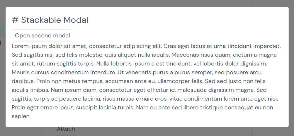
4. Stackable Animate Modal Window Component For Vue – vue-modal
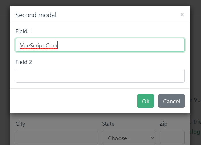
A tiny, responsive, animated, accessible, and stackable modal window solution for Vue.js powered web app.
Features:
- Lightweight, minified gzipped version is < 4kb
- Opens and closes with a data variable using
v-modelor with anameprop andshow/hidefunctions - Includes sensible default styling but it’s also highly customizable via user CSS classes and styles
- Override modal title and content via slots
- Modal intro and outro effects using CSS animation classes
- Exposes Component events –
before-open,opening,opened,before-close,closing,closed,update:modelValue(close) - Scrollable when its contents exceed screen height
- Closeable by clicking on the upper right “x”, the overlay or the
esckey - Stackable – Multiple modal windows on top of each other
- Ability to set initial focus on an element when the modal window opens, just set the autofocus attribute on an element inside the modal
- Focus management traps keyboard focus – tabbed navigation inside the modal window
- Ability to have unclosable modal windows
- Render on demand or stay always in DOM with “live” mode
- Modals appended to
<body>by default, ability to append to a custom element
5. Minimal Modal Component For Vue.js – Modaltor

A minimal modal component to create responsive, customizable, animated and scrollable modal windows in Vue.js app.
6. Swipeable Bottom Sheet Component – vue-swpie-modal
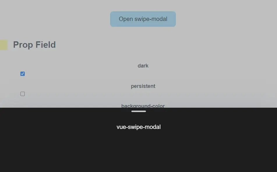
A Vue 3/2 component to create a swipeable inspired by the mobile bottom sheet as you’ve seen on iOS and Android.
7. Side Modal Component For Vue 3 – Side Panel
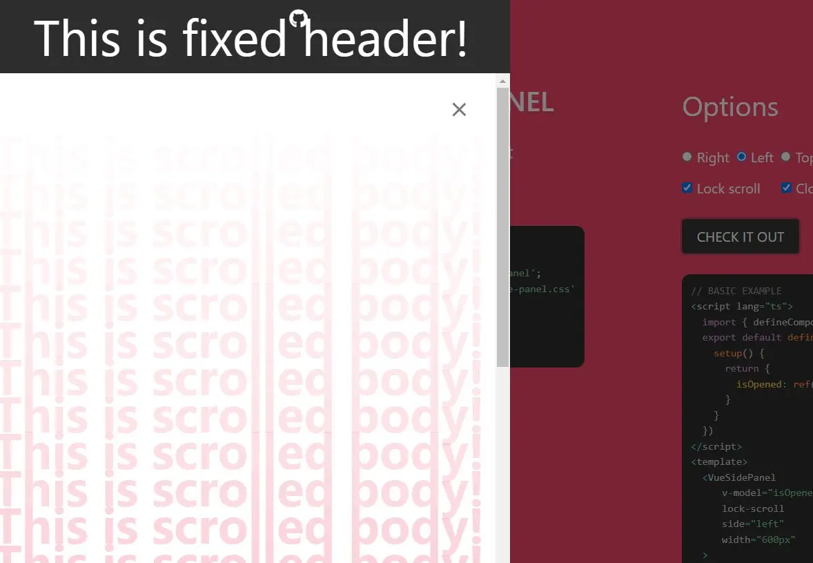
A side modal component for Vue 3 that allows you to create panels sliding from the edge of the screen, with a sticky header and/or footer.
Features:
- Top, Right, Bottom, Left sides.
- Slots for fixed header and footer areas.
- Body scroll lock included.
- Calculating of body height on screen resizing. (useful for setting “height: 100%” inside default slot)
- Animation Flexibility via Vue Transition support
8. nice-modal

A utility library that converts Vue.js modal components into Promise-based APIs.
- Simple and intuitive API
- Promise-based modal operations
- Framework agnostic – works with any UI library
- Lightweight, zero dependencies
- Supports both Vue 2 and Vue 3
- Full TypeScript support
9. An Easy Modal Manager For Vue – modal-provider
A Vue component that provides an easy way to generate and manage modal windows in your app.
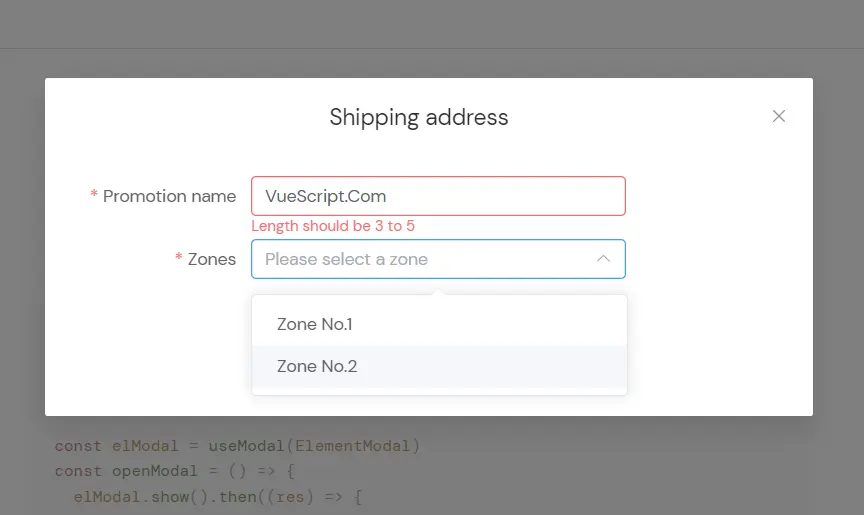
10. Beautiful Dialog Modal Component For Vue 3 – Gitart

A beautiful & customizable dialog and modal component created for Vue 3 applications.
Features:
- Stylize your dialogues as you wish. By default, there is only a frame to minimize the size of the package.
- Run your dialogs from any method without inserting them into the template.
- Take full advantage of typescript.
More Resources:
- 10 Best Modal Components In JavaScript & Pure CSS
- 10 Best Video Lightbox Plugin In JavaScript
- 10 Best Lightbox Gallery Plugins In JavaScript & CSS
- 10 Best Gallery Lightbox Libraries In Pure JavaScript
FAQ
Q: What accessibility features should a production modal include?
A: Production modals require focus trapping (keyboard navigation stays within the modal), ARIA attributes (role=”dialog”, aria-modal=”true”, aria-labelledby), and keyboard dismissal (Esc key closes the modal). Focus should move to the first interactive element when the modal opens, and return to the triggering element when it closes.
Q: How do I handle modal state with Vue Router?
A: Bind modal visibility to route query parameters or nested routes. When the user opens a modal, update the URL with router.push({ query: { modal: ‘example’ } }). The modal component watches the route and opens when the parameter appears.
Q: Why does my modal content jump when it first renders?
A: Content jump occurs when the modal calculates height after initial render. Pre-calculate dimensions by setting explicit heights or use min-height values that accommodate expected content. For dynamic content, render the modal with visibility: hidden first, measure the content height, then show it with the correct dimensions.
Q: Can I stack multiple modals without z-index conflicts?
A: Libraries like vue-modal and Final Modal manage z-index automatically when you open multiple modals. Each new modal receives an incremented z-index value. If you build custom stacking, maintain a counter that increments with each modal open event and decrements on close.