Install & Download:
# Vue 3
$ yarn add @takuma-ru/vue-swipe-modal@^4.0.0
# Vue 2
$ yarn add @takuma-ru/vue-swipe-modal@^4.0.0 @vue/composition-api
Description:
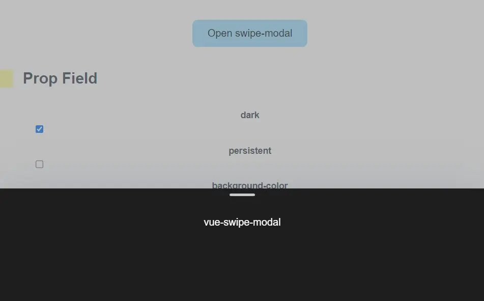
A Vue 3/2 component to create a swipeable inspired by the mobile bottom sheet as you’ve seen on iOS and Android.
How to use it:
1. Import and register the modal component.
// Vue 2
import { defineComponent, ref, reactive } from '@vue/composition-api';
import { swipeModal } from '@takuma-ru/vue-swipe-modal'
export default defineComponent({
  components: {
    swipeModal,
  },
  setup () {
    const modal = ref<boolean>(false)
    return {
      modal,
    }
  }
})
// Vue 3
import { ref } from 'vue'
import { swipeModal } from '@takuma-ru/vue-swipe-modal'
const modal = ref(false)2. Add the swipeable modal to the template.
<template>
  <div>
    <!-- Trigger Button -->
    <button @click="modal = true">open</button>
    <!-- Modal Component -->
    <swipe-modal
      v-model="modal"
      contents-height="50vh"
      border-top-radius="16px"
    >
      <h1>Modal Content</h1>
    </swipe-modal>
  </div>
</template>
3. Available component props.
// modal
modelValue: {
  type: Boolean,
  default: false,
},
dark: {
  type: Boolean,
  default: false,
},
// modal_background
persistent: {
  type: Boolean,
  default: false,
},
backgroundColor: {
  type: String,
  default: '#80808080',
},
// modal_contents
fullscreen: {
  type: Boolean,
  default: false,
},
noTip: {
  type: Boolean,
  default: false,
},
contentsWidth: {
  type: String,
  default: '100%',
},
contentsHeight: {
  type: String,
  default: '30vh',
},
borderTopRadius: {
  type: String,
  default: null,
},
borderTopLeftRadius: {
  type: String,
  default: '0px',
},
borderTopRightRadius: {
  type: String,
  default: '0px',
},
contentsColor: {
  type: String,
  default: 'white',
},
tipColor: {
  type: String,
  default: '#c8c8c8',
},
darkContentsColor: {
  type: String,
  default: '#1E1E1E',
},
Preview:
Changelog:
v5.0.1 (12/07/2023)
- Update


