Install & Download:
# NPM
$ npm i vue3-side-panel
Description:
Side Panel is a side modal component for Vue 3 that allows you to create panels sliding from the edge of the screen, with a sticky header and/or footer.
How to use it:
1. Import and register the side panel component.
import { createApp } from 'vue';
import VueSidePanel from 'vue3-side-panel';
import 'vue3-side-panel/dist/vue3-side-panel.css'
const app = createApp(App);
app.use(VueSidePanel);
2. Add the VueSidePanel component to the template.
<template>
  <VueSidePanel
    v-model="isOpened"
    width="450px"
  >
    <div style="padding-top: 70px; color: #f14668">
      <h2
        v-for="item in 50"
        :key="item"
        :style=""
        >
        This is scrolled body!
      </h2>
    </div>
  </VueSidePanel>
</template>
import { defineComponent, ref } from "vue";
export default defineComponent({
setup() {
return {
isOpened: ref(false)
}
}
})3. Available component props.
idName: {
  type: String as PropType<string>,
  default: 'vsp-container',
},
hideCloseBtn: {
  type: Boolean as PropType<boolean>,
  default: false,
},
noClose: {
  type: Boolean as PropType<boolean>,
  default: false,
},
side: {
  type: String as PropType<string>,
  validator: (value: string) => ['top', 'right', 'bottom', 'left'].includes(value),
  default: 'right',
  required: true,
},
zIndex: {
  type: [Number, String] as PropType<number | 'auto' | undefined>,
  default: 'auto',
},
width: {
  type: String as PropType<string>,
  default: 'auto',
},
height: {
  type: String as PropType<string>,
  default: 'auto',
},
lockScroll: {
  type: Boolean as PropType<boolean>,
  default: false,
},
lockScrollHtml: {
  type: Boolean as PropType<boolean>,
  default: true,
},
modelValue: {
  type: Boolean as PropType<boolean>,
  default: false,
  required: true,
},
overlayColor: {
  type: String as PropType<string>,
  default: 'black',
},
overlayOpacity: {
  type: Number as PropType<number>,
  default: 0.5,
},
overlayDuration: {
  type: Number as PropType<number>,
  default: 500,
},
panelColor: {
  type: String as PropType<string>,
  default: 'white',
},
panelDuration: {
  type: Number as PropType<number>,
  default: 300,
},
headerClass: {
  type: String as PropType<string>,
  default: '',
},
bodyClass: {
  type: String as PropType<string>,
  default: '',
},
footerClass: {
  type: String as PropType<string>,
  default: '',
},
Preview:
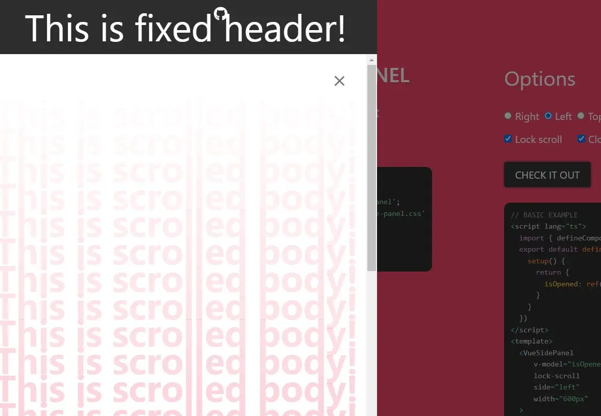
Changelog:
v1.2.0 (04/16/2023)
- Bugfixes