Install & Download:
# Yarn
$ yarn add vue3-snackbar
# NPM
$ npm i vue3-snackbar
Description:
An easy yet customizable toast & snackbar library for Vue 3 applications.
Fully compatible with the Composition API and Options API.
How to use it:
1. Import and register the library.
import { createApp } from "vue";
import { SnackbarService, Vue3Snackbar } from "vue3-snackbar";
// stylesheet
import "vue3-snackbar/dist/style.css";
import App from "./App.vue";
const app = createApp(App);
app.use(SnackbarService);
app.component("vue3-snackbar", Vue3Snackbar);
app.mount("#app");
2. Add the vue3-snackbar component to the app.vue.
 <vue3-snackbar bottom right :duration="5000">
 </vue3-snackbar>
// Options API
export default {
  methods: {
    successMessage() {
      this.$snackbar.add({
        type: 'success',
        text: 'This is a success message'
      })
    }
  }
}
// Composition API
import { useSnackbar } from "vue3-snackbar";
const snackbar = useSnackbar();
snackbar.add({
type: 'success',
text: 'This is a success message'
})3. All default props.
/* ******************************************
 * LOCATION PROPS
 ****************************************** */
/**
 * Render the snackbar at the top of the screen
 */
top: {
  type: Boolean,
  default: false,
},
/**
 * Render the snackbar at the bottom of the screen
 */
bottom: {
  type: Boolean,
  default: false,
},
/**
 * Render the snackbar on the left of the screen
 */
left: {
  type: Boolean,
  default: false,
},
/**
 * Render the snackbar on the right of the screen
 */
right: {
  type: Boolean,
  default: false,
},
/* ******************************************
 * COLOUR PROPS
 ****************************************** */
success: {
  type: String,
  default: "#4caf50",
},
error: {
  type: String,
  default: "#ff5252",
},
warning: {
  type: String,
  default: "#fb8c00",
},
info: {
  type: String,
  default: "#2196f3",
},
/* ******************************************
 * OTHER PROPS
 ****************************************** */
/**
 * The element to teleport the snackbar container to
 */
attach: {
  type: [String, HTMLElement],
  default: "body",
},
/**
 * Use the alternate border style for messages
 */
border: {
  type: String,
  default: "",
  validator: (v) => ["top", "bottom", "left", "right", ""].includes(v),
},
/**
 * The default time in ms for messages to stay on the screen
 */
duration: {
  type: Number,
  default: null,
},
/**
 * Class string to add to each message
 */
messageClass: {
  type: String,
},
/**
 * The z-index value of the snackbar container
 */
zIndex: {
  type: Number,
  default: 10000,
},
/**
 * Reduce padding on the y-axis for snackbar messages
 */
dense: {
  type: Boolean,
  default: false,
},
/**
 * Reverse the display order of snackbar messages
 */
reverse: {
  type: Boolean,
  default: false,
},
/**
 * Use snackbar groups with messages with the same group-key
 */
groups: {
  type: Boolean,
  default: false,
},
/**
 * Add shadow effect to messages
 */
shadow: {
  type: Boolean,
  default: false,
},
/**
* The background colour opacity when using border-style messages
*/
backgroundOpacity: {
  type: [String, Number],
  default: 0.12,
  validator: (v) => {
    return !isNaN(parseFloat(v)) && isFinite(v);
  },
},
/**
* Background colour when using border-style messages
*/
backgroundColor: {
  type: String,
  default: "currentColor",
},
/**
* Base layor background colour when using border-style messages
*/
baseBackgroundColor: {
  type: String,
  default: "#fff",
},
4. All possible parameters for the add method.
snackbar.add({
  // success, error, warning, info
  type: 'success',
  // title
  title: 'message title',

  // message
  text: 'message',
  // background color
  background: '#ccc',
  // is dismissable or not
  dismissible: true,
  // vue3-icon props
  // https://www.npmjs.com/package/vue3-icon
  icon: {},
  // message group key
  groupKey: ''
})
5. Clear all available messages.
snackbar.clear();
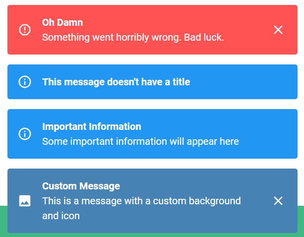
Preview:
Changelog:
v2.2.1 (03/22/2024)
- RTL support, removed SCSS and updated deps
v2.1.5 (03/01/2023)
- Update
v2.1.2 (02/28/2023)
- Bugfix
v2.1.0 (02/12/2023)
- Added three new props for use with the “border-style” messages
v2.0.0 (08/08/2022)
- Added reverse prop for changing the message stack order
v1.1.2 (01/08/2022)
- Added reverse prop for changing the message stack order
- Events for added, removed, dismissed and cleared are now available
- Minor style tweaks
- Dependencies bumped


