Install & Download:
# Yarn
$ yarn add vue3-easy-data-table
# NPM
$ npm i vue3-easy-data-table
Description:
An easy yet full-featured data table/grid component for Vue.js 3 applications.
It supports both fixed and dynamic data sources and has a lot of advanced features, such as live search, row sorting, column filtering, pagination, and more.
How to use it:
1. Import and register the data table component.
import Vue3EasyDataTable from 'vue3-easy-data-table';
import 'vue3-easy-data-table/dist/style.css';
const app = createApp(App);
app.component('EasyDataTable', Vue3EasyDataTable);
2. Create a basic data table and define your header & body data as follows:
<template>
  <EasyDataTable
    :headers="headers"
    :items="items"
  />
</template>
import type { Header, Item } from "vue3-easy-data-table";
export default defineComponent({
setup() {
const headers: Header[] = [
{ text: "Name 1", value: "name 1" },
// ...
];
const items: Item[] = [
{ "name": "Item 1", "height": 178, "weight": 77, "age": 20 },
// ...
];
return {
headers,
items
};
},
});3. Available data table props.
alternating: {
type: Boolean,
default: false,
},
buttonsPagination: {
type: Boolean,
default: false,
},
checkboxColumnWidth: {
type: Number,
default: null,
},
currentPage: {
type: Number,
default: 1,
},
emptyMessage: {
type: String,
default: 'No Available Data',
},
expandColumnWidth: {
type: Number,
default: 36,
},
filterOptions: {
type: Array as PropType<FilterOption[]>,
default: null,
},
fixedExpand: {
type: Boolean,
default: false,
},
fixedHeader: {
type: Boolean,
default: true,
},
fixedCheckbox: {
type: Boolean,
default: false,
},
fixedIndex: {
type: Boolean,
default: false,
},
headerTextDirection: {
type: String as PropType<TextDirection>,
default: 'left',
},
bodyTextDirection: {
type: String as PropType<TextDirection>,
default: 'left',
},
hideFooter: {
type: Boolean,
default: false,
},
hideRowsPerPage: {
type: Boolean,
default: false,
},
hideHeader: {
type: Boolean,
default: false,
},
indexColumnWidth: {
type: Number,
default: 60,
},
itemsSelected: {
type: Array as PropType<Item[]> | null,
default: null,
},
loading: {
type: Boolean,
deault: false,
},
rowsPerPage: {
type: Number,
default: 25,
},
rowsItems: {
type: Array as PropType<number[]>,
default: () => [25, 50, 100],
},
rowsPerPageMessage: {
type: String,
default: 'rows per page:',
},
searchField: {
type: [String, Array as PropType<String[]>],
default: '',
},
searchValue: {
type: String,
default: '',
},
serverOptions: {
type: Object as PropType<ServerOptions> | null,
default: null,
},
serverItemsLength: {
type: Number,
default: 0,
},
showIndex: {
type: Boolean,
default: false,
},
sortBy: {
type: [String, Array as PropType<String[]>],
default: '',
},
sortType: {
type: [String as PropType<SortType>, Array as PropType<SortType[]>],
default: 'asc',
},
multiSort: {
type: Boolean,
default: false,
},
tableMinHeight: {
type: Number,
default: 180,
},
tableHeight: {
type: Number,
default: null,
},
themeColor: {
type: String,
default: '#42b883',
},
tableClassName: {
type: String,
default: '',
},
headerClassName: {
type: String,
default: '',
},
headerItemClassName: {
type: [Function, String] as PropType<HeaderItemClassNameFunction | string>,
default: '',
},
bodyRowClassName: {
type: [Function, String] as PropType<BodyRowClassNameFunction | string>,
default: '',
},
bodyExpandRowClassName: {
type: [Function, String] as PropType<BodyRowClassNameFunction | string>,
default: '',
},
bodyItemClassName: {
type: [Function, String] as PropType<BodyItemClassNameFunction | string>,
default: '',
},
noHover: {
type: Boolean,
default: false,
},
borderCell: {
type: Boolean,
default: false,
},
mustSort: {
type: Boolean,
default: false,
},
rowsOfPageSeparatorMessage: {
type: String,
default: 'of',
},
clickEventType: {
type: String as PropType<ClickEventType>,
default: 'single',
},
clickRowToExpand: {
type: Boolean,
default: false,
},
tableNodeId: {
type: String,
default: '',
},
showIndexSymbol: {
type: String,
default: '#',
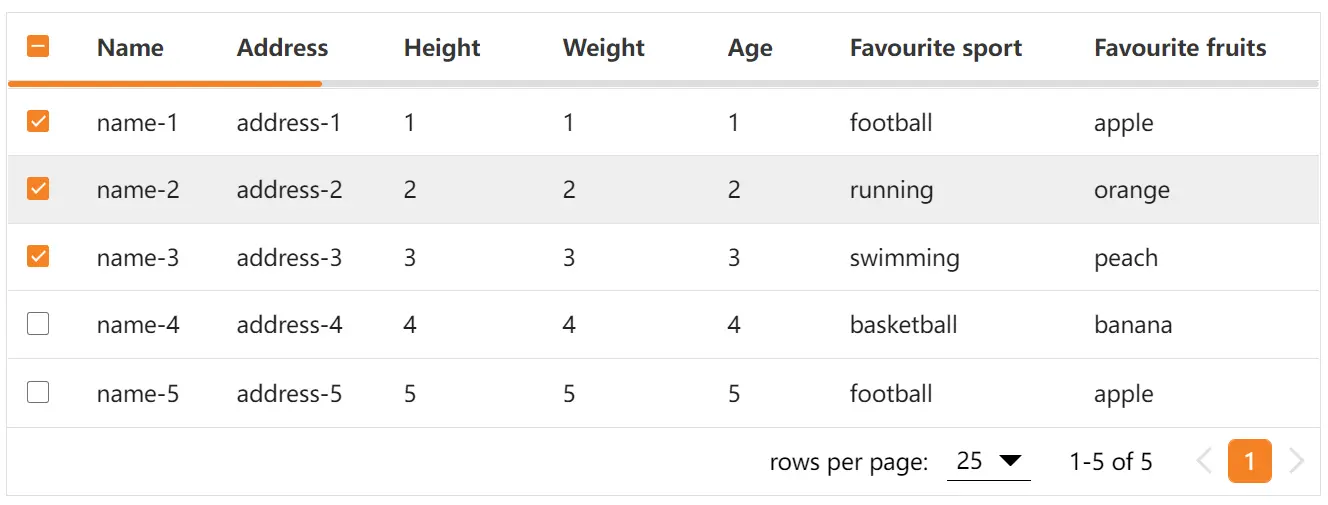
}Preview:
Changelog:
v1.5.45 (06/11/2023)
- Update vite version
v1.5.43 (03/26/2023)
- Fix nested value sorting including null or undefined.
v1.5.42 (03/22/2023)
- Remove useless table body td border-bottom style.
v1.5.41 (03/21/2023)
- Add select-all event.
v1.5.39 (03/18/2023)
- Fix the sorting feature not working when the column value is undefined or null.
v1.5.38 (03/15/2023)
- Add item slot
v1.5.35 (03/09/2023)
- add contextmenu event
- add customize-header slot
v1.5.34 (02/15/2023)
- Add empty-message and header slots
v1.5.32 (02/11/2023)
- Add filter comparison operator in
v1.5.31 (02/07/2023)
- Add $event to @click-row emit
v1.5.30 (01/31/2023)
- Add updateTotalItems event
- Add showIndexSymbol prop
v1.5.29 (01/29/2023)
- Add “type”: “module”
v1.5.28 (01/29/2023)
- Add updatePageItems event
v1.5.27 (01/20/2023)
- Update border-collapse
v1.5.26 (01/15/2023)
- Add new prop: tableNodeId
v1.5.25 (01/07/2023)
- Add CSS variable –easy-table-rows-per-page-selector-z-index
v1.5.24 (12/17/2022)
- Fix the second parameter of bodyItemClassNameFunction(column, index)
v1.5.22 (12/10/2022)
- Bugfix
v1.5.21 (12/07/2022)
- Add new param for expand-row event
v1.5.18 (11/30/2022)
- Add select-row event
v1.5.17 (11/28/2022)
- Update vue dependency.
v1.5.16 (11/18/2022)
- Add prop click-row-to-expand
- Fixed header value to lowercase in header name for slot
v1.5.12 (11/03/2022)
- Optimize multi sorting.
- Add bodyRowClassNameFunction.
v1.5.10 (10/31/2022)
- Update
v1.5.5 (10/12/2022)
- New prop: rows-of-page-separator-message
v1.5.3 (10/11/2022)
- New feature: Multiple fields sorting
v1.5.0 (10/04/2022)
- bugfix
v1.4.20 (09/29/2022)
- bugfix
v1.4.19 (09/15/2022)
- back to the 1st page when using async expanding
v1.4.18 (09/12/2022)
- Bugfixes
- Add current-page prop
v1.4.17 (09/02/2022)
- Fixed: async expand with selected items
v1.4.16 (09/01/2022)
- New prop: table-min-height
v1.4.15 (08/27/2022)
- Added new props and slots
v1.4.14 (08/13/2022)
- Expose rowsPerPage related variables and functions for the customization of rowsPerPage
v1.4.13 (08/10/2022)
- Add new CSS variables
v1.4.0 (07/26/2022)
- Refactory: use hooks
v1.3.17 (07/23/2022)
- Add custom filtering function
v1.3.15 (07/17/2022)
- Fix last index in server-side mode
v1.3.13 (07/15/2022)
- Add must-sort prop
v1.3.11 (07/10/2022)
- Drop dense feature
- Drop color customization feature
- Add CSS variables
- Add class name customization feature
- Add border cell feature
v1.3.4 (07/10/2022)
- New feature: async data for expand rows
v1.3.2 (07/07/2022)
- New feature: expand slot
v1.2.28 (07/05/2022)
- Add hide-header prop
v1.2.27 (07/01/2022)
- Optimize header sort click area.
v1.2.25 (06/29/2022)
- New slots and props.
v1.2.20 (06/28/2022)
- Support use via CDN
v1.2.19 (06/27/2022)
- Fix extra rows when using single field sorting feature
v1.2.18 (06/25/2022)
- Fix empty message background color.
v1.2.17 (06/24/2022)
- Fix table hover color
v1.2.16 (06/24/2022)
- update show-footer prop to hide-footer
v1.2.15 (06/23/2022)
- Fix column width bug in safari when using fixed-columns feature
v1.2.11 (06/23/2022)
- Added Column width and Fixed columns
v1.2.9 (06/18/2022)
- Fix current pagination not work in server-side mode
v1.2.8 (06/17/2022)
- support nested value in item and header value with ‘.’ character.
v1.2.5 (06/15/2022)
- Fixed init currentPaginationNumber to 1 when items updates
v1.2.4 (06/14/2022)
- Add click-row feature
v1.2.3 (06/12/2022)
- New filtering feature
v1.1.22 (06/09/2022)
- optimize source code
- fix loading mask style
v1.1.11 (06/07/2022)
- added show-footer
- added footer customization
v1.1.3 (06/07/2022)
- optimized
v1.1.0 (06/07/2022)
- fix the confliction between multiple selecting feature and show index feature
v1.0.27 (06/06/2022)
- color customization
- pagination slot
- bugfixes
v1.0.13 (06/04/2022)
- Optimized code
v1.0.11 (06/02/2022)
- Add alternating prop to color alternating (even and odd) rows.
- Add show-index prop to show index of item.


