Install & Download:
$ npm i autoresponsive-vue --save-devDescription:
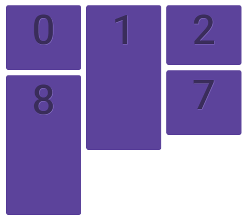
A magic responsive grid layout for vue.js app.
Usage:
Import the AutoResponsive.
import AutoResponsive from 'autoresponsive-vue';
Vue.use(AutoResponsive);
The basic example.
<template>
  ...
  <auto-responsive
    v-bind="options"
  >
    <div v-for="item in data" :style="style" class="item">{{ item }}</div>
  </auto-responsive>
  ...
</template>
<script>
  ...
  data() {
    return {
      data: [],
      options: {
        ...
      }
    }
  }
  ...
</script>
Default props.
props: {
  containerWidth: {
    type: Number,
    default: null
  },
  containerHeight: {
    type: Number,
    default: null
  },
  gridWidth: {
    type: Number,
    default: 10
  },
  prefixClassName: {
    type: String,
    default: pkg.name
  },
  itemClassName: {
    type: String,
    default: 'item'
  },
  itemMargin: {
    type: Number,
    default: 0
  },
  horizontalDirection: {
    type: String,
    default: 'left'
  },
  transitionDuration: {
    type: [String, Number],
    default: 1
  },
  transitionTimingFunction: {
    type: String,
    default: 'linear'
  },
  verticalDirection: {
    type: String,
    default: 'top'
  },
  closeAnimation: {
    type: Boolean,
    default: false
  },
  onItemDidLayout: {
    type: Function,
    default: () => {}
  },
  onContainerDidLayout: {
    type: Function,
    default: () => {}
  }
},
Preview: