Install & Download:
# For Vue 3
$ yarn add vue-final-modal@3
$ npm i vue-final-modal@3
# For Vue 2
$ yarn add vue-final-modal@2
$ npm i vue-final-modal@2
Description:
Final Modal is a tiny, elegant, renderless, mobile-friendly, feature-rich modal window component for Vue.js 3/2.
More Features:
- SSR support
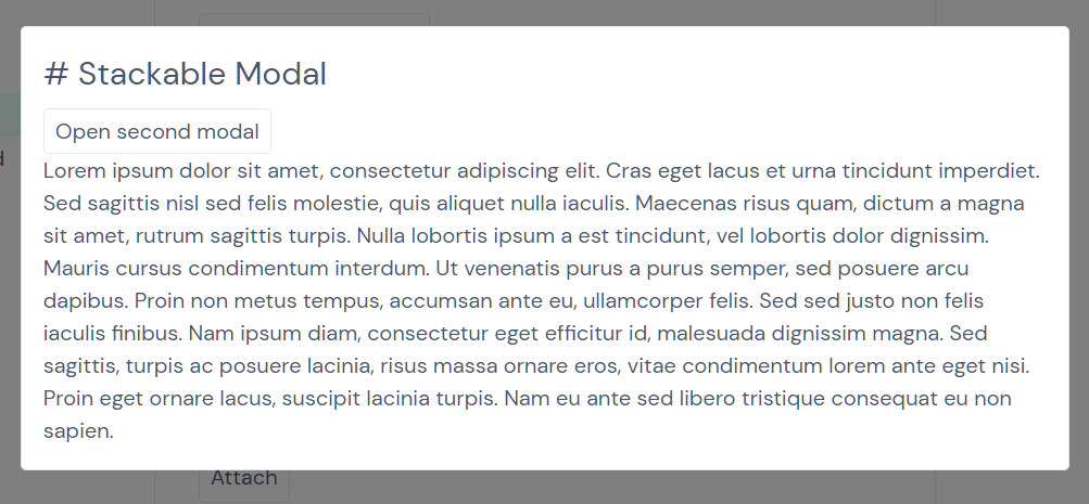
- Stackable
- Detachable
- Scrollable
- Smooth Transitions
- Vue.js compatible
Basic usage:
1. Import and register the modal component.
import { $vfm, VueFinalModal, ModalsContainer } from 'vue-final-modal'
export default {
  components: {
    VueFinalModal,
    ModalsContainer
  }
}
// or
import { vfmPlugin } from 'vue-final-modal'
App.use(vfmPlugin)
2. Add the modal component to the template.
<template>
  <vue-final-modal
    :name="null"
    :value="false"
    :ssr="true"
    :classes="false"
    overlay-class=""
    content-class=""
    styles=""
    overlay-style=""
    content-style=""
    :lock-scroll="true"
    :hide-overlay="false"
    :click-to-close="true"
    :esc-to-close="false"
    :prevent-click="false"
    :attach="false"
    transition="vfm"
    overlay-transition="vfm"
    :z-index-auto="true"
    :z-index-base="1000"
    :z-index="false"
    :focus-retain="true"
    :focus-trap="false"
    :fit-parent="true"
    :drag="false"
    drag-selector=""
    :keep-changed-style="false"
    :resize="false"
    :resize-directions="['t', 'tr', 'r', 'br', 'b', 'bl', 'l', 'tl']"
    :min-width="0"
    :min-height="0"
    :max-width="Infinity"
    :max-height="Infinity"
  >
    ...modal content here
  </vue-final-modal>
</template>
3. All default props.
/**
 * @description An uniq name for the open/close a modal via vfm.open/vfm.close APIs.
 * @default `undefined`
 * @example Symbol: `Symbol('MyModal')`
 * @example String: `'AUniqString'`
 * @example Number: `300`
 */
modalId: {
  type: [String, Number, Symbol] as PropType<ModalId>,
  default: undefined,
},
/**
 * @description Display the modal or not.
 * @default `undefined`
 * @example
 * ```js
 * const showModal = ref(false)
 * v-model="showModal"
 * ```
 */
modelValue: {
  type: Boolean as PropType<boolean>,
  default: undefined,
},
/**
 * @description Render the modal via `if` or `show`.
 * @default `'if'`
 * @example
 * ```js
 * displayDirective: 'if'
 * ```
 * @example
 * ```js
 * displayDirective: 'show'
 * ```
 */
displayDirective: {
  type: String as PropType<'if' | 'show'>,
  default: 'if',
  validator: (prop: any) => ['if', 'show'].includes(prop),
},
/**
 * @description Hide the overlay or not.
 * @default `undefined`
 * @example
 * ```js
 * hideOverlay="true"
 * ```
 */
hideOverlay: {
  type: Boolean as PropType<boolean>,
  default: undefined,
},
/**
 * @description Customize the overlay transition.
 * @default `undefined`
 * 'vfm-fade' | 'vfm-slide-down' | 'vfm-slide-up' | 'vfm-slide-right' | 'vfm-slide-left' | AnyString
 */
overlayTransition: {
  type: [String, Object] as PropType<VfmTransition | TransitionProps>,
  default: undefined,
},
/**
 * @description Customize the content transition.
 * @default `undefined`
 */
contentTransition: {
  type: [String, Object] as PropType<VfmTransition | TransitionProps>,
  default: undefined,
},
/**
 * @description Bind class to vfm__overlay.
 * @default `undefined`
 */
overlayClass: {
  type: undefined as unknown as PropType<any>,
  default: undefined,
},
/**
 * @description Bind class to vfm__content.
 * @default `undefined`
 */
contentClass: {
  type: undefined as unknown as PropType<any>,
  default: undefined,
},
/**
 * @description Bind style to vfm__overlay.
 * @default `undefined`
 */
overlayStyle: {
  type: [String, Object, Array] as PropType<StyleValue>,
  default: undefined,
},
/**
 * @description Bind style to vfm__content.
 * @default `undefined`
 */
contentStyle: {
  type: [String, Object, Array] as PropType<StyleValue>,
  default: undefined,
},
/**
 * @description Is it allow to close the modal by clicking the overlay.
 * @default `true`
 */
clickToClose: {
  type: Boolean as PropType<boolean>,
  default: true,
},
/**
 * @description Is it allow to close the modal by keypress `esc`.
 * @default `true`
 */
escToClose: {
  type: Boolean as PropType<boolean>,
  default: true,
},
/**
 * @description Is it allow to click outside of the vfm__content when the modal is opened
 * @default `'non-interactive'`
 */
background: {
  type: String as PropType<'interactive' | 'non-interactive'>,
  default: 'non-interactive',
  validator: (prop: any) => ['interactive', 'non-interactive'].includes(prop),
},
/**
 * @description
 * * Use `{ disabled: true }` to disable the focusTrap.
 * * Checkout the createOptions type here https://github.com/focus-trap/focus-trap for more.
 * @default `{ allowOutsideClick: true }`
 */
focusTrap: {
  type: [Boolean, Object] as PropType<false | Options>,
  default: () => ({
    allowOutsideClick: true,
  }),
},
/**
 * @description Lock body scroll or not when the modal is opened.
 * @default `true`
 */
lockScroll: {
  type: Boolean as PropType<boolean>,
  default: true,
},
/**
 * @description Define how to increase the zIndex when there are nested modals
 * @default `({ index }) => 1000 + 2 * index`
 */
zIndexFn: {
  type: Function as PropType<(context: { index: number }) => number | undefined>,
  default: ({ index }: { index: number }) => 1000 + 2 * index,
},
/**
 * @description The direction of swiping to close the modal
 * @default `none`
 * @example
 * Set swipeToClose="none" to disable swiping to close
 * ```js
 * swipeToClose="none"
 * ```
 */
swipeToClose: {
  type: String as PropType<'none' | 'up' | 'right' | 'down' | 'left'>,
  default: 'none',
  validator: (prop: any) => ['none', 'up', 'right', 'down', 'left'].includes(prop),
},
/**
 * @description Threshold for swipe to close
 * @default `0`
 */
threshold: {
  type: Number as PropType<number>,
  default: 0,
},
/**
 * @description If set `:showSwipeBanner="true"`, only allow clicking `swipe-banner` slot to swipe to close
 * @default `undefined`
 * @example
 * ```js
 * swipeToClose="right"
 * :showSwipeBanner="true"
 * ```
 * ```html
 * <VueFinalModal
 *   ...
 *   swipeToClose="right"
 *   :showSwipeBanner="true"
 * >
 *   <template #swipe-banner>
 *     <div style="position: absolute; height: 100%; top: 0; left: 0; width: 10px;" />
 *   </template>
 *   ...modal content
 * </VueFinalModal>
 * ```
 */
showSwipeBanner: {
  type: Boolean as PropType<boolean>,
  default: undefined,
},
/**
 * @description When set `:preventNavigationGestures="true"`, there will be two invisible bars for prevent navigation gestures including swiping back/forward on mobile webkit. For example: Safari mobile.
 * @default `undefined`
 * @example
 * Set preventNavigationGestures="true" to prevent Safari navigation gestures including swiping back/forward.
 * ```js
 * :preventNavigationGestures="true"
 * ```
 */
preventNavigationGestures: {
  type: Boolean as PropType<boolean>,
  default: undefined,
},
4. Events.
- @before-open: Before open
- @opened: When opened
- @before-close: Before close
- @closed: After closed
- @click-outside: On click outside
- @cancel: On cancel
Previews:
Changelog:
v4.5.4 (02/14/2024)
- Bug Fixes
v4.5.3 (12/14/2023)
- Bug Fixes
v4.5.0 (12/07/2023)
- add stop() for Open and beforeClose event
- add close function to defineSlots
- add overlayBehavior prop to VueFinalModal
- use getter and setter instead of computed for modelValueLocal
- bugfixes
v4.4.6 (11/08/2023)
- Bugfixes
v4.4.5 (07/27/2023)
- Bugfix
v4.4.4 (07/02/2023)
- modal: Add support for reserveScrollBarGap prop
v4.4.3 (06/28/2023)
- bugfix
v4.4.2 (04/24/2023)
- bugfix
v4.3.1 (04/17/2023)
- bugfix
v4.3.0 (04/12/2023)
- support visible value of displayDirective
v4.1.4 (03/31/2023)
- Bugfixes
v4.1.2 (03/30/2023)
- Bugfixes
v4.1.1 (03/28/2023)
- Bugfixes
v4.1.0 (03/28/2023)
- Add activeVfm (inspire by pinia), so we don’t need to pass down vfm instance anymore. We can use useVfm() and useModal() out of setup script
- Destroy dynamic modal onClosed by default and add keepAlive option for keeping modal instance alive after modal.close()
v4.0.11 (03/08/2023)
- Bugfixes
v4.0.10 (03/07/2023)
- Bugfixes
v4.0.9 (03/02/2023)
- Bugfixes
v4.0.7 (03/01/2023)
- Bugfixes
v4.0.5 (03/01/2023)
- update z-index after state changes
v4.0.4/3 (02/14/2023)
- Bugfixes
v4.0.2/3 (02/10/2023)
- Bugfixes
v4.0.1 (02/08/2023)
- Ability to use <VueFinalModal /> without register createVfm() plugin
- Bug Fixes
v4.0.0 (10/29/2022)
- Providing the useModal composable function
- Supporting Nuxt 3 SSR
- Rewritten with TS for a better DX
- Support new props including swipe-to-close, threshold, showSwipeBanner, preventNavigationGestures
- Support slot swipe-banner
- Add built-in support transition names including: ‘vfm-fade’ | ‘vfm-slide-down’ | ‘vfm-slide-up’ | ‘vfm-slide-right’ | ‘vfm-slide-left’
v3.4.3 (10/29/2022)
- Bugfix
v3.4.2 (10/04/2021)
- Bugfix
v3.4.0 (08/02/2021)
- Allow importing component directly
v3.3.1 (06/12/2021)
- Bugfix
v2.3.1 (05/24/2021)
- Fixed Cannot read property ‘removeEventListener’ of undefined when using resize in nuxt and navigating away
v2.3 (05/16/2021)
- Make modal draggable and resizable
v2.2 (05/05/2021)
- update
v2.1 (03/22/2021)
- feat: Added custom transition object support
- refactor: keydown event is refactored for more generic use
v3.0.1 (03/09/2021)
- Support String type for the slots of dynamic modal
v2.0/3.0 (03/07/2021)
- Dynamic modals
v1.8.8 (03/04/2021)
- Bugfix
v1.8.6 (02/09/2021)
- fix: mobile safari dont scroll
v1.8.5 (01/21/2021)
- fix: Scroll blocking doesn’t work on ios(safari)
v1.8.3 (12/28/2020)
- fix: $vfm.openedModals should not reference with $vfm.modals
v1.8.2 (12/28/2020)
- fix type name typo for vue-final-modal@next
v1.8.1 (12/16/2020)
- Bugfix
v1.8.0 (12/15/2020)
- support prop zIndexAuto
- support $vfm.get API
- support vetur intellisense
- refactor lock-scroll prop
- Bugfix
v1.7.1 (12/08/2020)
- fix: beforeDestroy should not emit before-close event
v1.7.0 (12/08/2020)
- make before-open, before-close stoppable
- passing params in show method
v1.6.3 (12/03/2020)
- fix compatibility with choices.js
v1.6.2 (12/01/2020)
- Fixed Background shifts when modal is opened (if background has scrollbar)
v1.6.0 (11/13/2020)
- Support Esc key to close modal for Vue 3
v1.5.2 (11/12/2020)
- remove cursor poiner on overlay.
v1.5.0 (11/09/2020)
- Support customize configuration include key and componentName.
- Bugfix: Scrollbar only reappears when all the modals are closed.
v1.4.2 (11/02/2020)
- Fix modal instance is not removed when the component is destroyed.
v1.4.1 (10/26/2020)
- remove lockScroll after modal leave
v1.3.0 (10/16/2020)
- Built-in focusTrap for a11y
v1.14 (10/01/2020)
- A11y support
- New event @click-outside
- Remove useless slots content-before, content, content-after
v1.0.1 (10/01/2020)
- Support Vue 3.0
v0.13.4 (09/28/2020)
- fixed css transition
- call handleLockScroll only when value is true
v1.0.0beta (09/22/2020)
- Support Vue 3.0
v0.13.3 (09/16/2020)
- fixed body-scroll-lock on mobile
v0.13.1 (09/02/2020)
- Fixed: Modal DOM element should be removed at beforeDestroy hook
v0.13.0 (09/01/2020)
- Add new prop zIndexBase.
- Support auto binding zIndex with modalStackIndex.
- Fixed computed isComponentReadyToBeDestroyed.
- Refactor VueFinalModal style.
- Set prop attach default from body to false.