Install & Download:
Description:
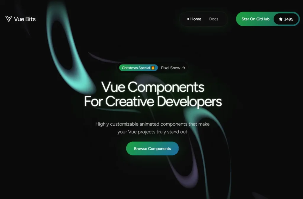
Vue Bits is an open-source collection of 100+ animated UI components for your next Vue/Nuxt applications.
It uses the motion-v library to manage complex animations, gestures, and transitions while maintaining a lightweight dependency tree.
Features
- 🎨 100+ Animated Components: Text animations, motion effects, UI components, and background patterns across four main categories.
- 📦 Minimal Dependencies: Each component runs independently with motion-v as the primary requirement.
- 🔧 CLI Installation: Install components through jsrepo CLI or copy code manually into your project.
Preview

How to Use It
Installation via CLI
Install individual components using the jsrepo CLI tool. This method downloads the component file directly into your project.
npx jsrepo@latest add https://vue-bits.dev/r/CarouselManual Installation
Install the motion-v dependency first:
npm install motion-vCopy the component code into your project. Create a new file for the component:
<template>
<template>
  <div
    ref="containerRef"
    :class="[
      'relative overflow-hidden p-4',
      round ? 'rounded-full border border-[#333]' : 'rounded-[24px] border border-[#333]'
    ]"
    :style="{
      width: `${baseWidth}px`,
      ...(round && { height: `${baseWidth}px` })
    }"
  >
    <Motion
      tag="div"
      class="flex"
      drag="x"
      :dragConstraints="dragConstraints"
      :style="{
        width: itemWidth + 'px',
        gap: `${GAP}px`,
        perspective: 1000,
        perspectiveOrigin: `${currentIndex * trackItemOffset + itemWidth / 2}px 50%`,
        x: motionX
      }"
      @dragEnd="handleDragEnd"
      :animate="{ x: -(currentIndex * trackItemOffset) }"
      :transition="effectiveTransition"
      @animationComplete="handleAnimationComplete"
    >
      <Motion
        v-for="(item, index) in carouselItems"
        :key="index"
        tag="div"
        :class="[
          'relative shrink-0 flex flex-col overflow-hidden cursor-grab active:cursor-grabbing',
          round
            ? 'items-center justify-center text-center bg-[#111] border border-[#333] rounded-full'
            : 'items-start justify-between bg-[#111] border border-[#333] rounded-[12px]'
        ]"
        :style="{
          width: itemWidth + 'px',
          height: round ? itemWidth + 'px' : '100%',
          rotateY: getRotateY(index),
          ...(round && { borderRadius: '50%' })
        }"
        :transition="effectiveTransition"
      >
        <div :class="round ? 'p-0 m-0' : 'mb-4 p-5'">
          <span class="flex h-[28px] w-[28px] items-center justify-center rounded-full bg-[#0b0b0b]">
            <i :class="item.icon" class="text-white text-base"></i>
          </span>
        </div>
        <div class="p-5">
          <div class="mb-1 font-black text-lg text-white">{{ item.title }}</div>
          <p class="text-sm text-white">{{ item.description }}</p>
        </div>
      </Motion>
    </Motion>
...
Import it into your project.
<template>
  <Carousel
    :items="carouselItems"
    :base-width="300"
    :autoplay="true"
    :autoplay-delay="3000"
    :pause-on-hover="true"
    :loop="true"
    :round="false"
  />
</template>

<script setup lang="ts">
  import Carousel from "./Carousel.vue";
  import type { CarouselItem } from "./Carousel.vue";

  const carouselItems: CarouselItem[] = [
    {
      title: "Custom Item",
      description: "A custom carousel item.",
      id: 1,
      icon: "circle",
    },
    {
      title: "Another Item",
      description: "Another carousel item.",
      id: 2,
      icon: "layers",
    },
    // Add more items as needed
  ];
</script>
Related Resources
- Motion One: Animation library for web applications. Drives smooth transitions and physics-based motion.
- Vue Use: Collection of Vue 3 composition utilities. Handles common patterns like event listeners and reactive state.
- Nuxt UI: Component library built for Nuxt 3. Includes form controls, layouts, and navigation elements.
- Headless UI Vue: Unstyled accessible components for Vue. Manages focus, keyboard navigation, and ARIA attributes.
FAQs
Q: Can I modify the component styling?
A: Yes. The components use standard Vue templates with class bindings. Modify the template classes or add scoped styles to match your design system.
Q: Does this work with TypeScript?
A: Yes. Components include TypeScript interfaces for props and items.
Q: What Vue version do I need?
A: Components require Vue 3 or Nuxt 3. The composition API and script setup syntax depend on Vue 3 features.
Q: Can I use multiple components together?
A: Yes. Each component operates independently. Combine text animations with backgrounds or layer multiple UI components in the same view.