Install & Download:
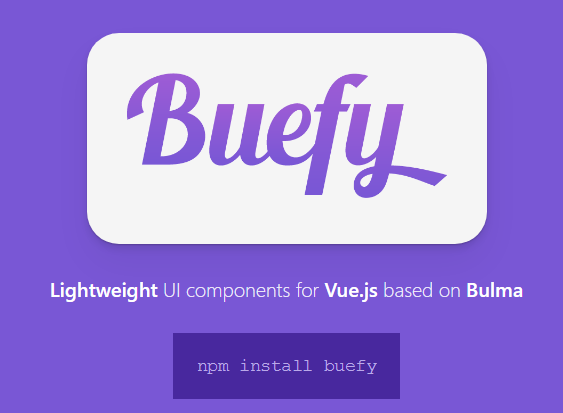
npm install buefyDescription:
Buefy is a lightweight library of responsive UI components for Vue.js based on Bulma framework and design.
Features:
- Keep your current Bulma theme / variables easily
- Supports both Material Design Icons and FontAwesome
- Very lightweight with none internal dependencies aside from Vue & Bulma
- Semantic code output
- Follows Bulma design and some of the Material Design UX
- Focus on usability and performance without over-animations
Preview:
Changelog:
v0.9.29 (03/31/2024)
- Bugfixes
v0.9.28 (02/11/2024)
- Update & bugfix
v0.9.27 (01/03/2024)
- Update & bugfix
v0.9.25 (09/26/2023)
- Update & bugfix
v0.9.24 (09/23/2023)
- Update
v0.9.23 (03/05/2023)
- Update
v0.9.22 (09/11/2022)
- Shipped with Bulma 0.9.4
- Add messages prop to message slot in field
- Add long-press prop to number input
- Bugfixes
v0.9.21 (05/21/2022)
- Bugfix
v0.9.20 (04/17/2022)
- Add checkbox-type prop to table
- Bugfixes
v0.9.19 (03/02/2022)
- Bugfixes
v0.9.18 (03/02/2022)
- Add open and close events to tooltip
- Improve accessibility of dropdown, collapse and tabs
- Bugfixes
v0.9.27 (02/22/2022)
- Bugfixes
v0.9.16 (02/19/2022)
- Add Font Awesome 6 support
- Bugfixes
v0.9.15 (02/16/2022)
- New component: Colorpicker
- Add year to week-number-click event
- Add icon-size prop to notification
- Add page input to pagination and table
- Allow any keyword as step of numberinput
- Bugfixes
v0.9.14 (12/30/2021)
- Add normalize string for search in tables
- Add year to week-number-click event
- Add start and end slot to tabs
- Add active-change event to navbar dropdown
- Bugfixes
v0.9.11 (10/31/2021)
- Bugs fixed
- New component: Breadcrumb
- Add progress bar (remaining time to close) to notification
- Add selectable-header and selectable-footer props to autocomplete
- Add close-button-aria-label prop to modal
- Add navbar burger and dropdowns to be focusable and keyboard selectable
v0.9.10 (09/14/2021)
- Bugfixes
v0.9.9 (08/16/2021)
- Add tag prop to navbar dropdown
- Add select-on-click-outside prop to autocomplete
- Add aria-labelledby prop to checkbox and switch
- Add icon-right and icon-right-clickable props to datepicker and datetimepicker
- Add caption prop to table
- Add pause-on-hover prop to toast
- Improve number input validation
- Enable click event to notification
- Show switch control label if slot exists
- Prevent emitting the prompt value when inputted text is compositing
- Bugfix
v0.9.8 (06/20/2021)
- Shipped with Bulma 0.9.3
- Support keep first on taginput elements
- Add missing typehints for the notification component
- Improve accessibility to dropdown and autocomplete
- Add detail-icon prop to Table component
- Add delay prop to Sidebar component
- Bugfix
v0.9.7 (04/21/2021)
- Add transition appear to tabs/steps
- Add draggable-column prop to table
- Fix bugs
v0.9.6 (04/08/2021)
- Fix datetimepicker timezone
- Fix datepicker when append-to-body and auto open when value change
- Fix remove outline from step-item and tab-item on focus
- Fix first option selected on taginput when autocomplete
v0.9.5 (03/31/2021)
- Shipped with Bulma 0.9.2
- Add rounded prop to Upload
- Add icon-right-type prop to Input
- Add icon-right prop to Datepicker
- Add cancel-text prop to Snackbar
- Add indefinite prop to Toast
- Automatically select hovered option on blur for Autocomplete
- Add aria-label prop to Modal
- Add alt attribute to placeholder image
- Add caption slot to Image
- Add defaultSwitchRounded default configuration option
- Add detail-transition prop to Table
- Accept Date as values for Select
- Display events on unselectable Datepicker cell
- Add aria-minus-label and aria-plus-label functions for b-numberinput
- Add th-attrs and td-attrs functions for b-table
- Improve a11y on tab component
- Bugs fixed
v0.9.4 (01/06/2021)
- Shipped with Bulma 0.9.1
- Add
is-lightvariant to tooltip - Add support for multiple progress bars
- Add
cellclickevent to b-table - Add
controls-alignmentprop to Numberinput - Add
left-labelprop to switch component - Add
indicatorprop to show Slider value inside thumb - Add
autoFocusprop to Modal - Add
aria-close-labelprop to Taginput - Support
localein Slider - Add
sticky-checkboxoption to b-table - Add
roundedprop to table pagination - Add
tooltip-alwaysprop for Slider component - Add
#headerslot inside of b-message to place a custom header - Add
week-number-clickevent to Datepicker - Add toggleDetails to default Table slot
- Add
invalidevent to Upload - Add
custom-searchprop to table column - Add aria-label prop
- Bugfix
v0.9.3 (09/03/2020)
- Add animation prop to steps and tabs
- Add range to datepicker when type is month
- Add after-enter and after-leave events tp modal
- Add min-step prop to number input
- Add lazy prop to input
- Add centered propt to navbar
- Add new progress bar text color
- Bugs fixed
v0.9.2 (08/21/2020)
- Add group-label and group-options prop to autocomplete and taginput
- Add support to vnode array on programmatic component using message prop
- Add defaultTooltipDelay constructor option
- Add contextmenu event to tooltip triggers
- Add alt, src-fallback and error prop to image
- Add append staticClass to tooltip when append-to-body
- Bugs fixed
v0.9.1 (08/18/2020)
- Add is-expanded class to menu item
- Bugs fixed
v0.9.0 (08/16/2020)
- Vue.js 2.6+ is now the minimum required version
- Bulma 0.8.0 and 0.9.0
- Table, new default slot and table column syntax
v0.8.20 (05/26/2020)
- Add close-on-confirm prop to dialog
- Fix typo activeStep variable
- Fix open autocomplete on clearable icon when open-on-focus