Install & Download:
# Yarn
$ yarn add @growthbunker/vuedarkmode
# NPM
$ npm install @growthbunker/vuedarkmode --save
Description:
A modern and tiny UI component library that helps you create dark design Vue.js applications with ease.
Components included:
- Alert
- Avatar
- Badge
- Button
- Divider
- Heading
- Icon
- ProgressBar
- Spinner
- Toast
- Checkbox
- ImageUploader
- Input
- InputNumber
- Radio
- Select
- Tabs
- Textarea
- Toggle
Previews:
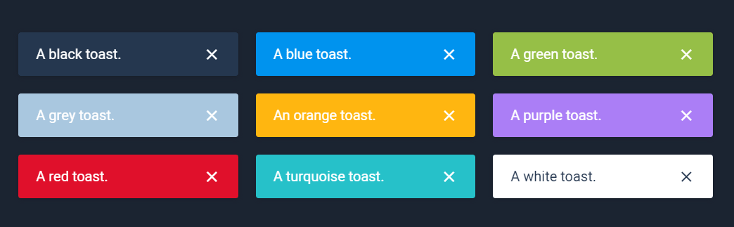
Toast

Form Fields
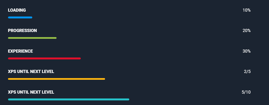
Progress Bar

Button
Badge
Avatar
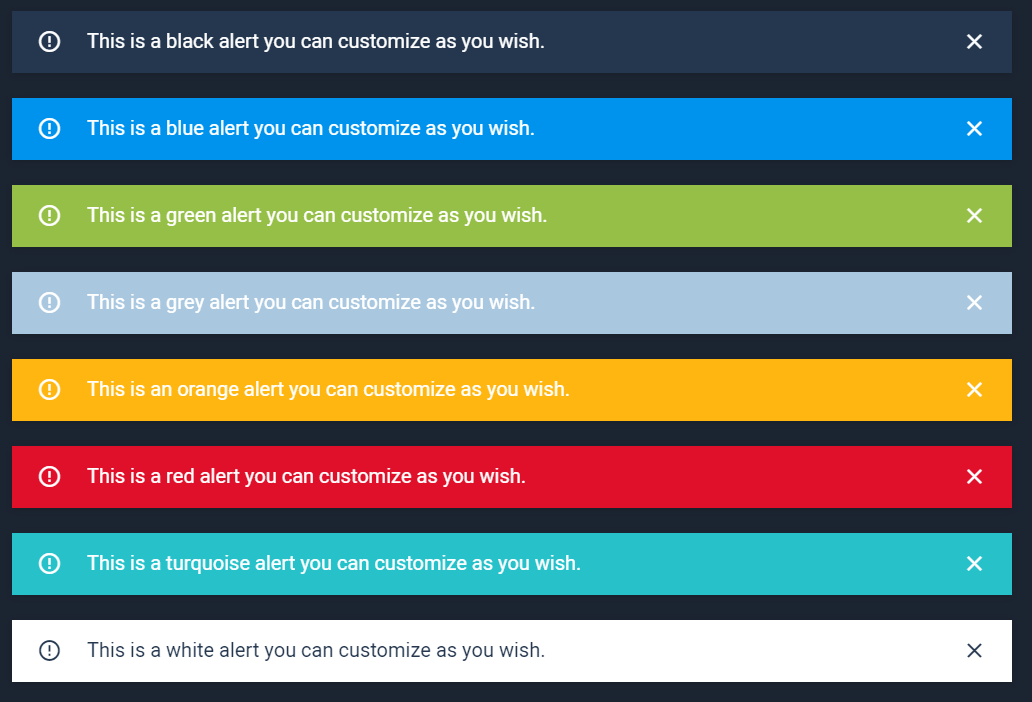
Alert